-
Enterprise Application Redesign: From the Bottom Up

This article was originally posted on sitepen.com Not long ago, good design was considered nice to have, but non-essential to a product or company. In today’s market, however, good design has become a commodity. The apps we use on our phones, our laptops, or even on our TVs are constantly scrutinized based on their quality […]
Read More » -
Less Clicking, More Binging

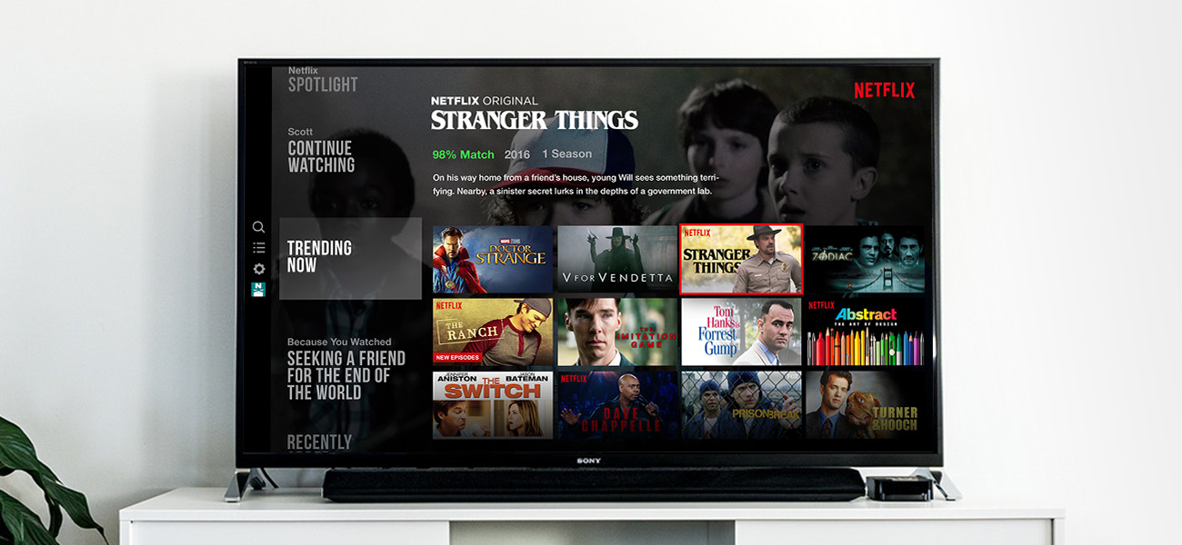
This article was originally posted on sitepen.com Whether it’s Game of Thrones or an old season of Rupaul’s Drag Race, it’s pretty likely you’ll be streaming something tonight from your TV. Netflix, Hulu, Sling — these are the apps that dominate our quiet evenings. And while many of us don’t consider them apps, they are […]
Read More » -
Out of the (Drop)Shadows

It is strange that the drop shadow is a visual relic that has managed to cling to UI design for decades. But why? Can an opinionated flat design still have depth and truly be free of drop shadows? What would that even look like?
Read More » -
Moving, Not Moving

Six years ago, I decided to spend some time designing an app called EventBoard with Zach Holmquist. As it turns out, that single decision has had a huge impact on my career. EventBoard is now a full-fledged enterprise SaaS company, boasting some of the best customers imaginable, and it’s maintaining a strong growth trajectory. Being […]
Read More » -
The Stepford Wives – Alexa, Cortana, and Siri

Yesterday, an interesting article by Mandy Brown caught my attention. It focussed on the lack of originality that exists in the current world of artificial intelligence. The article resonated with me because I’ve long felt that our mainstream AI bots like Siri, Cortana, OK Google, and, the recent, Alexa have a blatant heavy-hand on gender […]
Read More » -
The State of the Hover State

Mobile UI design has been at a severe disadvantage to designing for the web for one prominent reason: discoverability. Web designers (and even desktop app designers, for that matter) have the advantage of using hover states to train their users on interaction in their designs. Hover states are used to convey clickable elements, use different […]
Read More » -
Putting Your Dribbble Likes to Work

If you’re anything like me, you frequently come across amazing shots on Dribbble, you like them, and then, before you know it, you’ve forgotten about them. And that’s the end of the story. That shot gets buried in your account history, likely to never be seen again. I’m a big believer that creative inspiration is usually found in others’ creative content, and I decided to actually make something happen with those Dribbble shots.
Read More » -
Designing an Alternative to the Hamburger Menu

Ok, I’m sure you’re tired of reading articles and hearing conversations centered around the three small lines of the hamburger menu. Is it a bad UI pattern? Is it ok? Well, this isn’t a post about whether it’s good or bad. The fact is, I believe it’s a poor design decision, take it or leave […]
Read More » -
What I Think of Adobe XD

When I learned that Adobe was building a new product that was focused around user experience design and prototyping, I was thrilled. Back then, it was under the code name of “Project Comet.” I’ve been anxiously awaiting it for quite some time now. But before it was released, I found out it wouldn’t be just […]
Read More » -
What I’ve Been Up To Lately

For any of you reading this, it’s no secret that I’ve been pretty radio-silent for the last couple of years. The truth is, things have been busy. 2013 turned into a bit of a rollercoaster ride, and things have been racing ever since. This month, I finally got around to updating my site with new […]
Read More »