Mobile UI design has been at a severe disadvantage to designing for the web for one prominent reason: discoverability. Web designers (and even desktop app designers, for that matter) have the advantage of using hover states to train their users on interaction in their designs. Hover states are used to convey clickable elements, use different cursors to hint at the type of interaction required, and even reveal additional menus/features based on the cursor’s proximity to certain areas of the design. It’s a great way to make a UI more powerful.
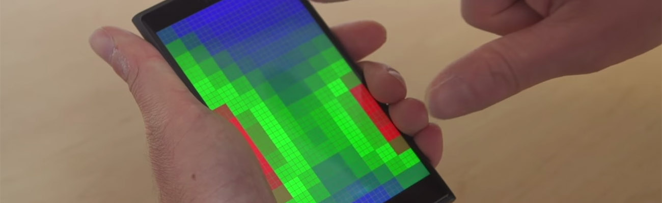
With the mobile-first movement, there’s been an effort to focus less on hover states in UI design. Since mobile users don’t have the luxury of hover, designers have to design to that lowest common denominator. But the good news is: technology in touch interfaces is finally catching up. Microsoft is leading some experiments that showcase a powerful new way to enhance touch UI. Take a look at their Pre-touch sensing demo:
Ahem. You still there? Go ahead and wake up, the video is over. You’d think they’d put a little more showmanship into the video for how amazing this really is. This could, in a very real way, change how designers create mobile UI. The video just scratches the surface of what’s possible. Hidden menus, drawers, UI that doesn’t have to look interactive – it can all become possible on mobile. And as far as the user is concerned, they will have a more immersive and smarter experience that requires even less taps to get to what they’re looking for.
Honestly, this is the type of tech that I would expect Apple to be innovating. Sadly, they think they have better things to be working on.
Hi There!
I'm Scott, and I love writing things like this. But I spend most of my time working as a designer.
See my work»