Whether it’s Game of Thrones or an old season of Rupaul’s Drag Race, it’s pretty likely you’ll be streaming something tonight from your TV. Netflix, Hulu, Sling — these are the apps that dominate our quiet evenings. And while many of us don’t consider them apps, they are services that we consistently interact with on a daily basis. But despite how ubiquitous these apps have become in our lives, there is one thing they are getting wrong — the user experience for navigating content.
Video streaming services, especially on the TV, are lagging behind in UX design. Despite everything that we’ve learned as the web and digital world has matured, fundamental mistakes are being made constantly in the world of set-top boxes.
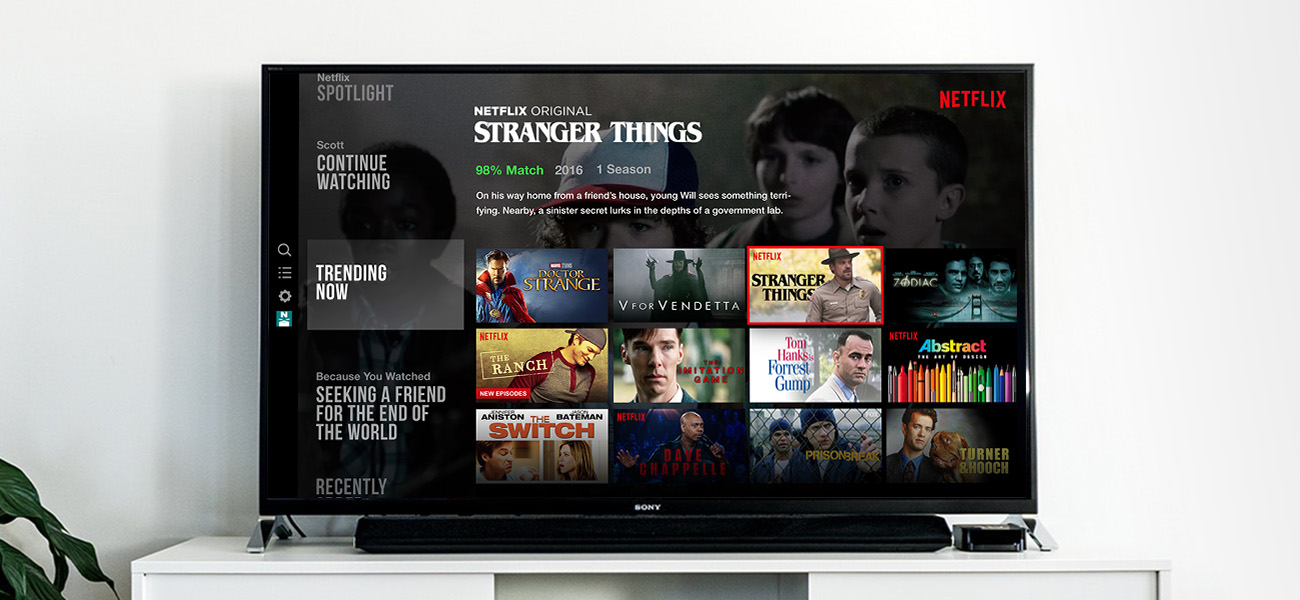
Netflix and chill click
If you build something for the web or mobile, clicks and taps will invariably be a part of the UX discussion. “How many clicks does it take to do this?” “Can we eliminate taps to make this feature more discoverable?” Questions like these are important; the fewer contact points required from the user, the more likely they’ll have a successful experience with the product.
But in the world of steaming video from your TV, this metric seems to be overlooked entirely. Think about this the next time you’re trying to *click* find *click* something *click* to *click* watch *click* on *click* Netflix. Your experience has been reduced to this:

The shear fatigue of the experience is overwhelming. It’s comparable to walking into a Blockbuster (yeah, remember those?) and picking up one movie at a time. Can you imagine how long it would take to find something? And yet that’s what these apps expect from the user. The UI, while it might seem filled with beautiful content, is forcing you to make dozens of clicks, browsing one item at a time.
The underlying issue is simple, though not obvious: these interfaces rely on lists to browse content. Episodes, channels, movies — they are all presented to the user as lists. And why shouldn’t they? If this was a web app, this decision would make perfect sense. Most of the apps we use on the web and our mobile devices are built around lists.
The problem is the remote. This isn’t a web app. It’s meant for TV, and TV apps don’t have the luxury of complex user input devices (mouse, trackpad, touchscreen). Even the remote for the Apple TV isn’t a natural substitution for those inputs. Scrolling simply isn’t a thing in the world of TV UI. Users are forced to rely on a D-pad and a couple of menu buttons. That’s it! And yet video apps are being designed without adhering to this constraint. They may look beautiful (looking at you, new Hulu design) but they are ultimately not user-focused. And when the user is forced to take a back seat, so will engagement; it’s a lose-lose situation.
Utilizing the Grid
So what can be done? The best way to alleviate user fatigue is to find ways to serve more content/choices with fewer clicks. Why pick up one movie at a time when you can browse a whole shelf? Move away from lists and serve content using grids instead. With a grid, the user can click through rows of content, allowing their eyes to consume more while their thumb clicks less.
Some of the apps use this concept already, but only on ancillary views. These views are harder to find, and not usually sought out by the user. Instead, the entire UI should be built around serving up content in a grid right from the start. To illustrate this, here’s a basic prototype:
(Click on the window to activate the prototype, then use your arrow keys to navigate)
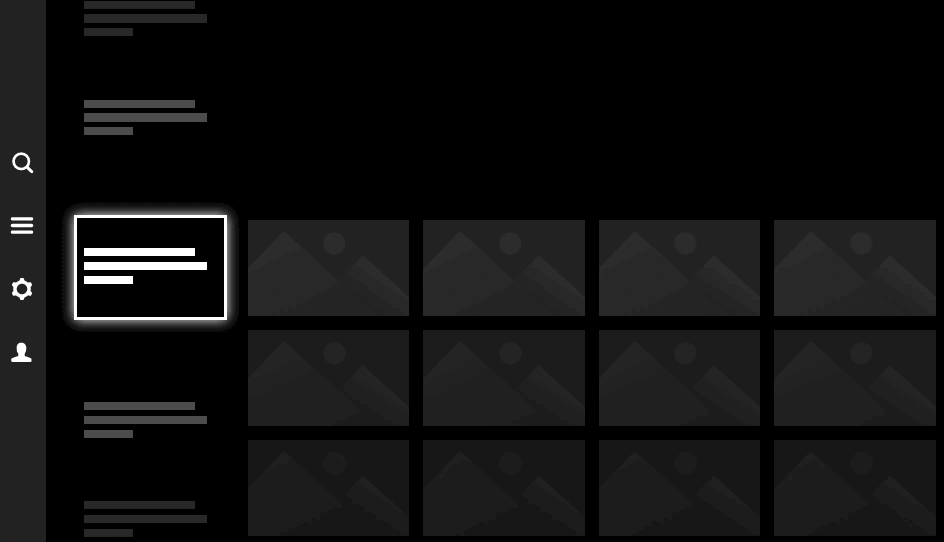
This accomplishes a few things well:
- It allows the user to move through much more content with only a handful of clicks. Clicks between categories deliver 12 shows at a time, and clicks inside of the categories deliver 4 per row.
- Since this surfaces more initial content for each category, it also allows the user to browse at a high level before committing to an entire category. You’ll know whether “Independent 90’s movies featuring a female protagonist” is actually a category that looks interesting.
- It keeps higher level nav items visible and easily accessibile. No more endless clicking back to the top to find the search.
The solution is not without challenges, and this example’s not perfect. But I’m also not on the Netflix payroll. A few design cycles could iron out most of the remaining pain points to make this experience feel completely natural. The bottom line is that there are clearly ways to improve the experience, and TV apps should be pushing those boundaries rather than settling for what they’ve built elsewhere.
The Series Finale
But let’s be honest, most of us aren’t building apps for TV on a daily basis, so what’s the bigger takeaway? A good user experience is built on acknowledging constraints rather than ignoring them. Whether you’re building a new app or translating a product to another platform, question everything. It might not be a problem with using lists, but it could be that rudimentary. Even the most typical conventions and design patterns might be the very things that confound your users. Always design it from their side of the screen.
Fade to black, roll credits.
Hi There!
I'm Scott, and I love writing things like this. But I spend most of my time working as a designer.
See my work»