To say that I was disappointed when Apple released iOS7 in 2013 is an understatement. To be on-trend, Apple had flattened their entire UI without any real reinforcing principles. This came with countless oversights to the user’s experience which took a backseat to dropping skeuomorphism. It was flat for the sake of flat. Compare this with Google’s Material Design which came shortly after. Material embraced flat design with a specific opinion — mimicking real-world materials. This immersive design language incorporated the flat look while also maintaining depth. How? By using big, soft drop-shadows.
Just looking at the two design languages, it’s clear that Material took the better approach. Even putting aside the rich animations, Material Design provided a cleaner user experience that was also forward thinking and visually appealing. It was flat, but with the important compromise of shadow. This small compromise allows Material to maintain depth and look more polished. Even Apple seems to think so; they’ve been subtly letting drop shadows slip into their UIs ever since.
And now Microsoft, who were flat before flat was cool, have announced their new design language: Fluent Design. It looks great, but it also looks extremely trendy — big, soft drop shadows.
It is strange that the drop shadow is a visual relic that has managed to cling to UI design for decades. It doesn’t matter what the design patterns of the day embody, drop shadows are our go-to crutch for creating depth. But why? Does it need to be that way? Can an opinionated flat design still have depth and truly be free of drop shadows? What would that even look like?
A Different Approach
The fact is, we are surrounded by a world that is full of depth, and very little of it is defined by shadow. If we are going to replace drop shadows in our visual UI metaphors, we should look at other options that create depth in the world around us.
So how do we perceive depth when shadows aren’t involved? There are a couple easy answers. Scale is the most obvious solution — big things are nearby, small objects are far away. Linear perspective is another, using an objects dimensionality to recede into space. But for either of those approaches to be really effective it would require a 3D environment. Building a two dimensional UI around those three dimensional principles would feel gimmicky and distracting. Until AR and VR are more commonplace, that’s just not an option.
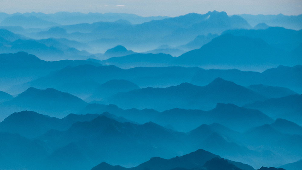
This lead me to another, lesser known type of depth perception. Atmospheric perspective is the phenomena where the atmosphere between the viewer and an object shifts the value and hue of the object. The further away the object is, the more atmosphere and the stronger the effect. If you look at a distant mountain range, you’ll know what I’m talking about. Utilizing this principle is a common technique in painting and art. I was first introduced to the concept when studying traditional Japanese landscape ink paintings. If you want a more recent example, pick up any video game art book and you’ll see it being used heavily in their environments and landscapes. So what if we took that concept and applied it to UI design? I decided to explore the possibilities for myself.
Creating the Effect
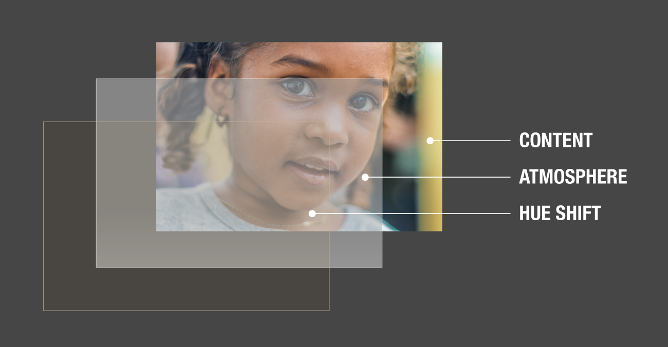
As a proof of concept — and a small side project — I took it upon myself to see if this could actually translate. But before any UI elements could be built, I needed to create a basic formula for simulating the effect. I wanted to approach this as a big picture concept to see if it could support an entire design system, not just a few screens in a single app. First, I broke down the effect into three core components: The content, the atmosphere, and the hue.
Content
This represents the actual object, whether it’s a photo or a button in the UI. It is the object with full exposure and correct color.
Atmosphere
This layer represents the density of atmosphere between the user and the object. It specifically affects the object’s value by muting the tones. Whites are less white, blacks are less black.
Hue
This layer only shifts the hue of the object, including the atmospheric layer beneath it. In the real world, this color shift relates to the color that is being reflected in the atmosphere. Often it’s blue for the same reasons as the sky, but it can be any color that becomes predominant in the light. In a sunset, for example, the colors become more orange and red. To mimic this flexibility, this layer would take on the color of another object in the UI — a background image, maybe a cover photo — and would serve to shift the hue of all other elements within that view.
Creating Increments
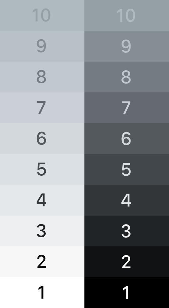
But creating the basic effect was only the first step. If this was going to be used to simulate depth, that meant it needed multiple levels or increments. Furthermore, I wanted to use a standard when creating my designs and not just eye-ball each screen to ‘what looks good.’ So I developed a basic 10-step system to represent different layers of depth that were possible in the design.
The big takeaway here is that objects do not approach the ends of the value spectrum like they do when using typical overlays or shadow. Overlays simply darken all of the elements, pushing them closer and closer to black (or white, if it is a white overlay). In the atmosphere model, objects actually approach a middle-of-the-spectrum area. This means that blacks and whites become less clear and more muted.
This creates a big opportunity for contrast, which is very important for simulating depth. If you design your foreground at a level one, with a background at a level six or seven, you’re actually free to use a broader range of bold colors and values. Use black text. Use white text. It will have the contrast to stand out, giving the designs more flexibility.
Incorporating a User Interface
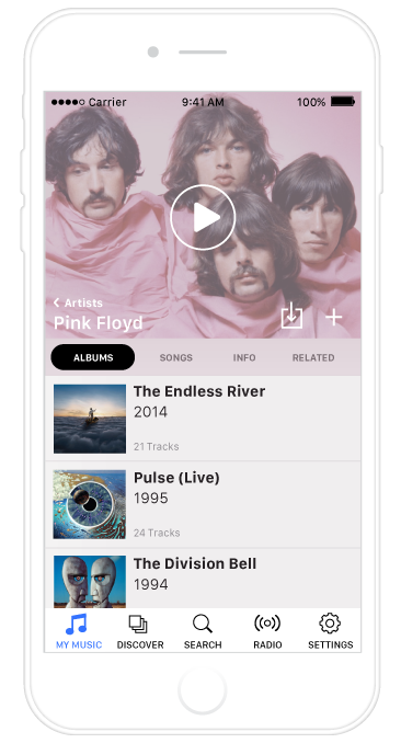
After working through this it was time to put the concept to a test by applying it to a UI. I decided to go with a music app, because hey, the world really needs one more music app design, right? Honestly it was just an easy place to start. Using a basic design, I broke the UI into several groups and then applied the atmospheric system to each of them. Interactive elements like the tab bar and play controls were kept at level one, while backgrounds and subordinate elements were pushed back into other levels. The cover photo was used as the color influence, giving the entire view a subtle influence of pink hues in the example.
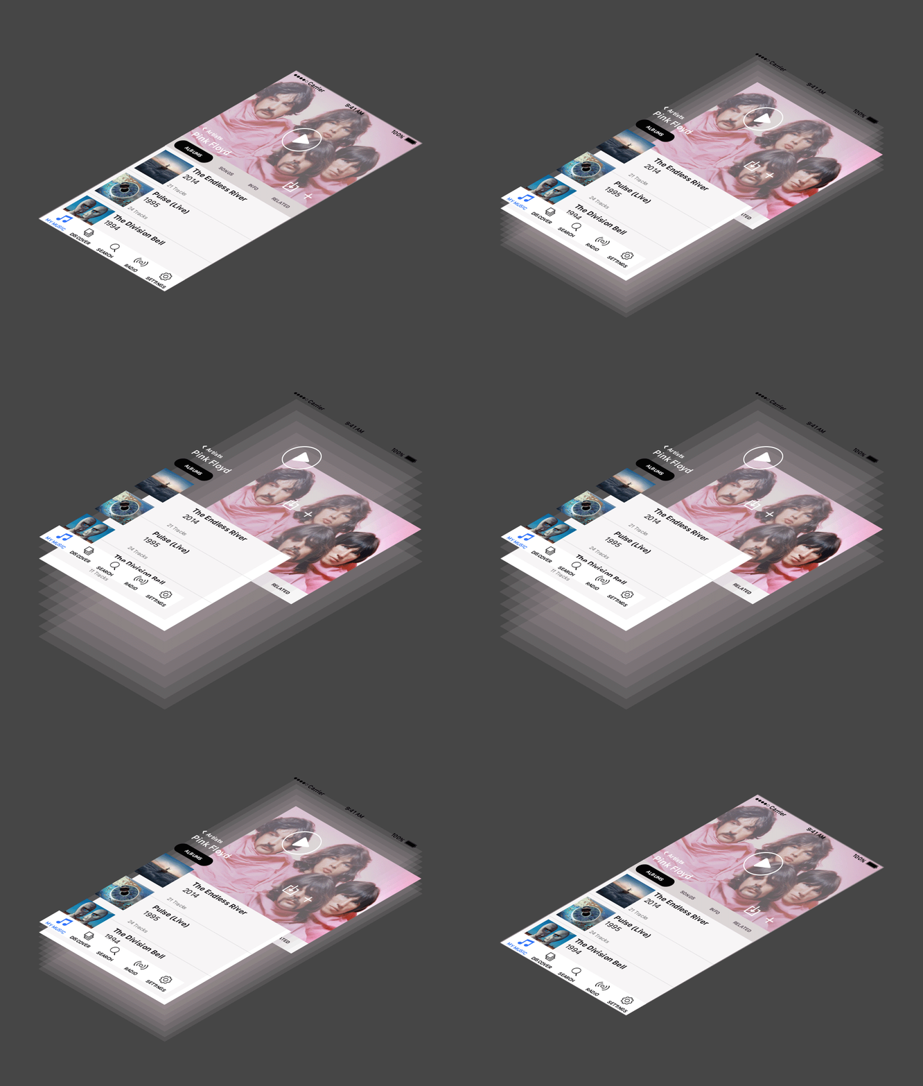
The result? The system worked. At least, it did in my eyes. Maybe you’re thinking, ‘Nah, that design looks all washed out and muted.’ Really, it looks great on an actual device. What surprised me the most was how my eye naturally found its way through the UI. The interactive elements seemed to pop, making them easy to find and focus on. The other elements receded in space, still providing context and depth. And the best part?
Not a single drop shadow needed.
OS-Level Design Systems
I decided to push the concept further. Could an entire design language be based on a principle like this? What would system-level interactions look like if they incorporated atmospheric perspective to distinguish themselves from app-level elements? What I found is that the OS level is really where a concept like this would shine. Multi-tasking, notifications, control center — these are all things that require a concept of depth to break the chrome of other apps being used on the screen. This is particularly important on mobile, where an app is allotted the entire screen real estate.
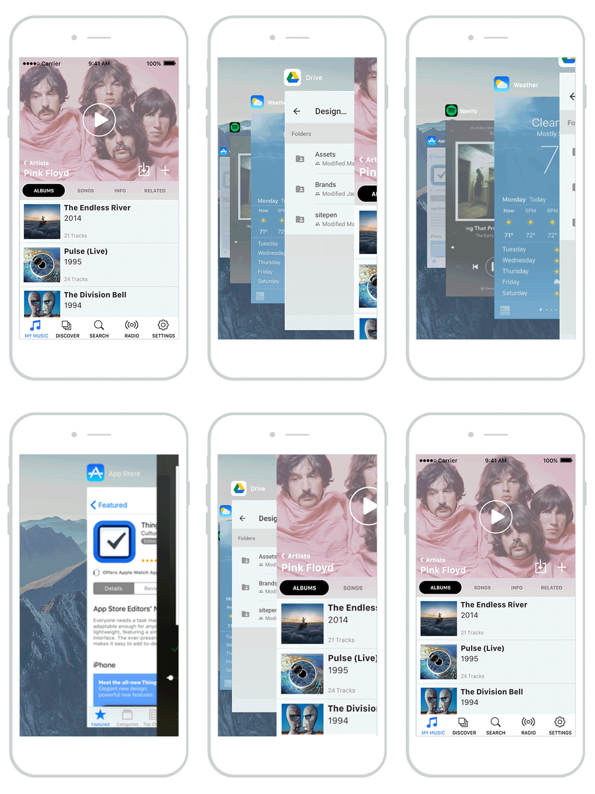
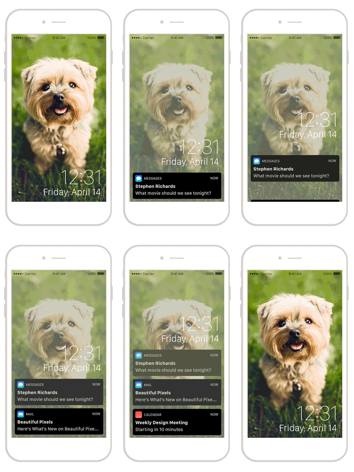
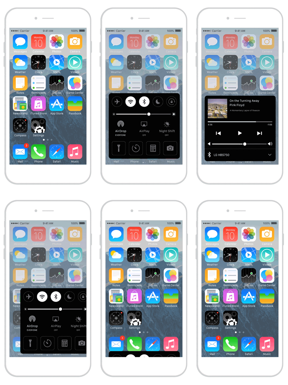

Obviously a desktop OS doesn’t suffer the same needs of a mobile UI, but there is no reason this concept wouldn’t scale up to work for a larger screen. It would be particularly useful to solve one specific problem — drop shadows to distinguish separate windows. No matter the platform, that is one problem no one seems able to get around. Using an atmospheric model, inactive windows could be pushed back in space. This would keep them entirely visible for reference, while making the active window perfectly clear to the user. It might even be easier to stay focused.
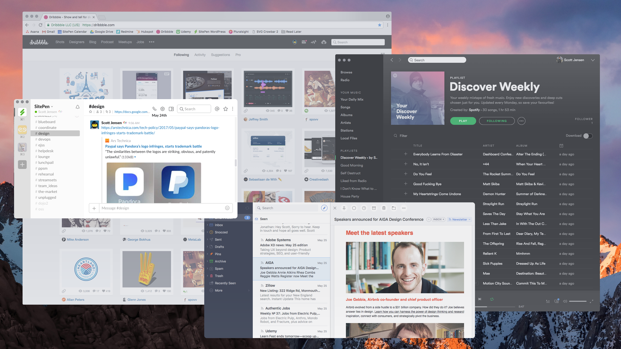
So there it is — a flat visual system that can still utilize depth without compromising its flat-ness. Overall the experiment was a success, and something that I would love to see included in a design system. It would be great in a single app, but would really stand out if someone like Apple used a concept like this to opinionate their design.
A Few Last Notes
These designs aren’t baked. They aren’t ready to be deployed to millions of devices around the world. They’re pretty rough and include plenty of oversights. I know that. All of this is simply a proof of concept and the result of one designer going through some self-imposed explorations over a few nights and weekends. I’m not an entire team, and I wouldn’t pretend to be more capable than any of the folks at Apple, Google, or anywhere else. There would be countless other considerations required in order to fully realize a concept like this, and the system itself could use a lot more fine tuning. My goal was to discover whether that potential even existed. In my opinion, I believe it does.
Will drop shadows ever disappear from UI? Probably not. Despite this proof of concept, I will still be using them frequently. I’m even using them on this very website. In a perfect world, a UI concept like this would likely still incorporate drop shadows to push it even further. I simply chose to challenge myself by avoiding them completely. The point is, there is a big visual world outside that our eyes naturally understand. As designers, we have a lot of tools at our disposal for translating that world into an interface. There’s no need to always stick with what has been done in the past.
Lastly, I’d love to hear what you think! Send me a tweet and let me know.
Hi There!
I'm Scott, and I love writing things like this. But I spend most of my time working as a designer.
See my work»
