When I learned that Adobe was building a new product that was focused around user experience design and prototyping, I was thrilled. Back then, it was under the code name of “Project Comet.” I’ve been anxiously awaiting it for quite some time now. But before it was released, I found out it wouldn’t be just focussed on UX and prototyping – it would also include design tools baked into it. That might seem like a good thing, but to me, it was a bad sign:
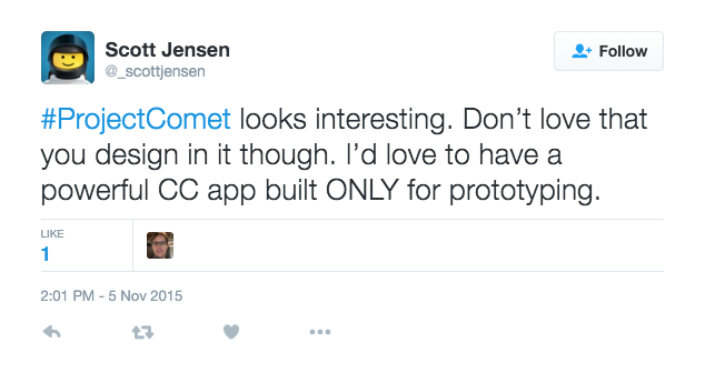
This was concerning to me because it meant that the feature set would be split between two different approaches. Thanks to Adobe, I already have great apps for creating designs. Illustrator and Photoshop are incredibly powerful, and between the two of them, I can create designs for just about any media. If Adobe Comet was going to try to be a design app, it was likely it wouldn’t support the feature-rich design process that I already enjoy in Illustrator. But I took comfort in a reply from one of the project managers from Adobe:
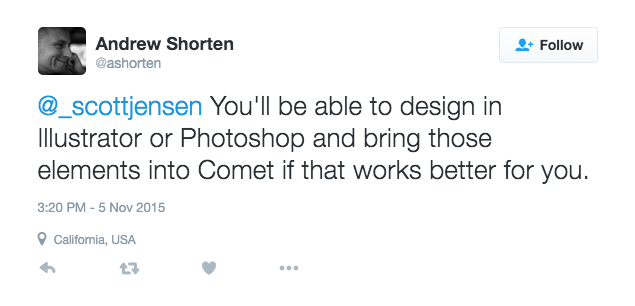
Ok. Adobe has done a really great job at making their apps work together. I’m sure when Project Comet comes out, it will have some awesome import/linking options for Illustrator and Photoshop files.
No, I Was Right – It’s Unusable
Adobe officially released project Comet and called it Xd (Experience Design). And after a couple of weeks of working with it, my fears for the product have been completely realized. Xd can’t decide what type of app it wants to be. Is it a design platform? Is it a prototyping tool? It is as if Sketch and inVision got a little tipsy one weekend and Xd was the ugly, socially inept love child of that mistake. It is an empty app, with limited features for design and even more limitations for prototyping.
The Design Features
Before we get too far down the rabbit hole, you’re probably wondering “What about the integration into AI and PS?” Here’s your answer: copy + paste. Adobe, in their infinite wisdom, thinks that copy + paste counts as integrating two products together. If you copy a PS file, it doesn’t do anything neat like pulling in individual layers or anything like that. It’s a flattened image. That wouldn’t be so bad if you could at least link the PS file – but no, there isn’t any concept of linking in Xd. Illustrator files get a slight advantage, as they remain vectors that can be modified inside of Xd. But again, no linking, no importing, nothing.
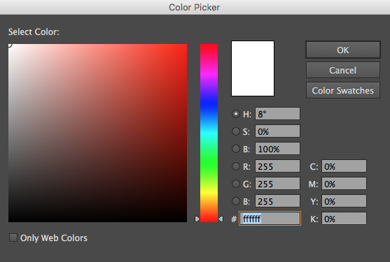
Anyone who has used Sketch at all will notice that Xd is a blatant response to that platform. How the artboards work, the tool bar and inspector, it all feels a whole lot like Sketch and very little like Adobe. Even a lot of the shortcut keys that I’ve found standard in CC have changed in Xd. I think that was a mistake on their part. The whole app feels like it was built from scratch, reproducing or omitting design tools that already exist and that are more powerful in other Adobe products. A great example of this is the color picker. Rather than incorporate the typical Adobe picker, they’ve punted and gone with the OSX default (gotta love that colored pencil option!).
There are a number of severe limitations to the tools, as well. Type settings only allow for the selection of font size, typeface, justification, and letter spacing. No line height or paragraph options exist. There’s also no way to create gradients, and anyone used to working with those in Illustrator will miss that quick. And it pretty much goes without saying that none of the raster effects like blur, inner glow, etc. are available.
To sum it all up, here are the design features Xd needs in order for me to find it usable:
- Gradients
- Adobe’s Color Picker
- Better Typography Options
- Import/Linking to Other Adobe Files
The Prototyping Features
Since the design side of the app isn’t usable to me, I thought there might be some hope for the prototyping side. I was wrong. This portion of the app feels less than half-baked, and anyone accustomed to building their user flows with InVision will quickly abandon this product. There are only a few transitions to choose from between screens, and some of them aren’t even handled in the correct behavior. There isn’t any ability to drag and create custom hotspots on the design. Instead, you’re forced to select one of the design elements as a clickable area. That’s not a big deal if you created the design in Xd, but, as I already mentioned, that isn’t an option. Xd also doesn’t support any type of fixed headers or footers or overlay screens. All of these are givens if you’re working with InVision or Marvel App.
To sum it up, here’s what I need to use this as a prototyping tool:
- Custom Hotspots
- Hotspot Templates
- More (and Better) Screen Transitions
- Overlay Views
- Linking to the Previous Screen
- Fixed Headers/Footers
There are a Few Good Things
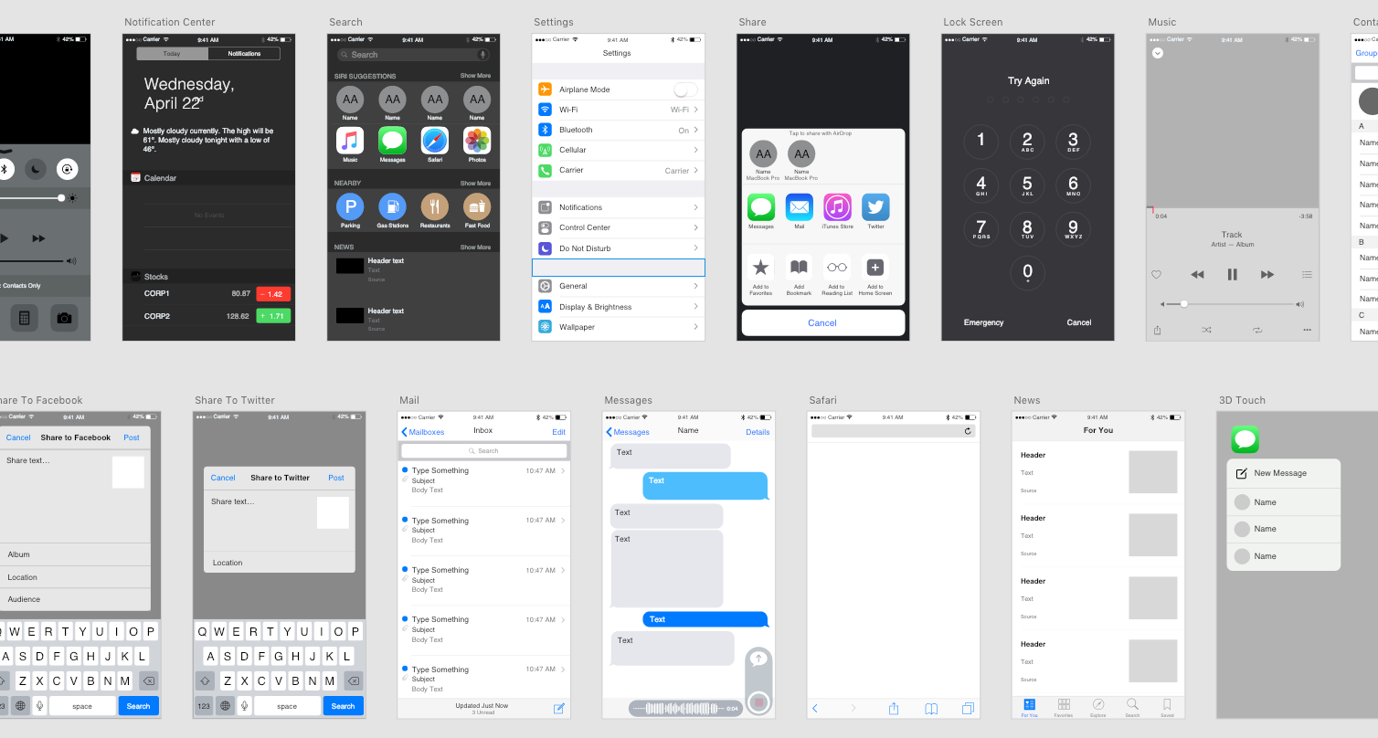
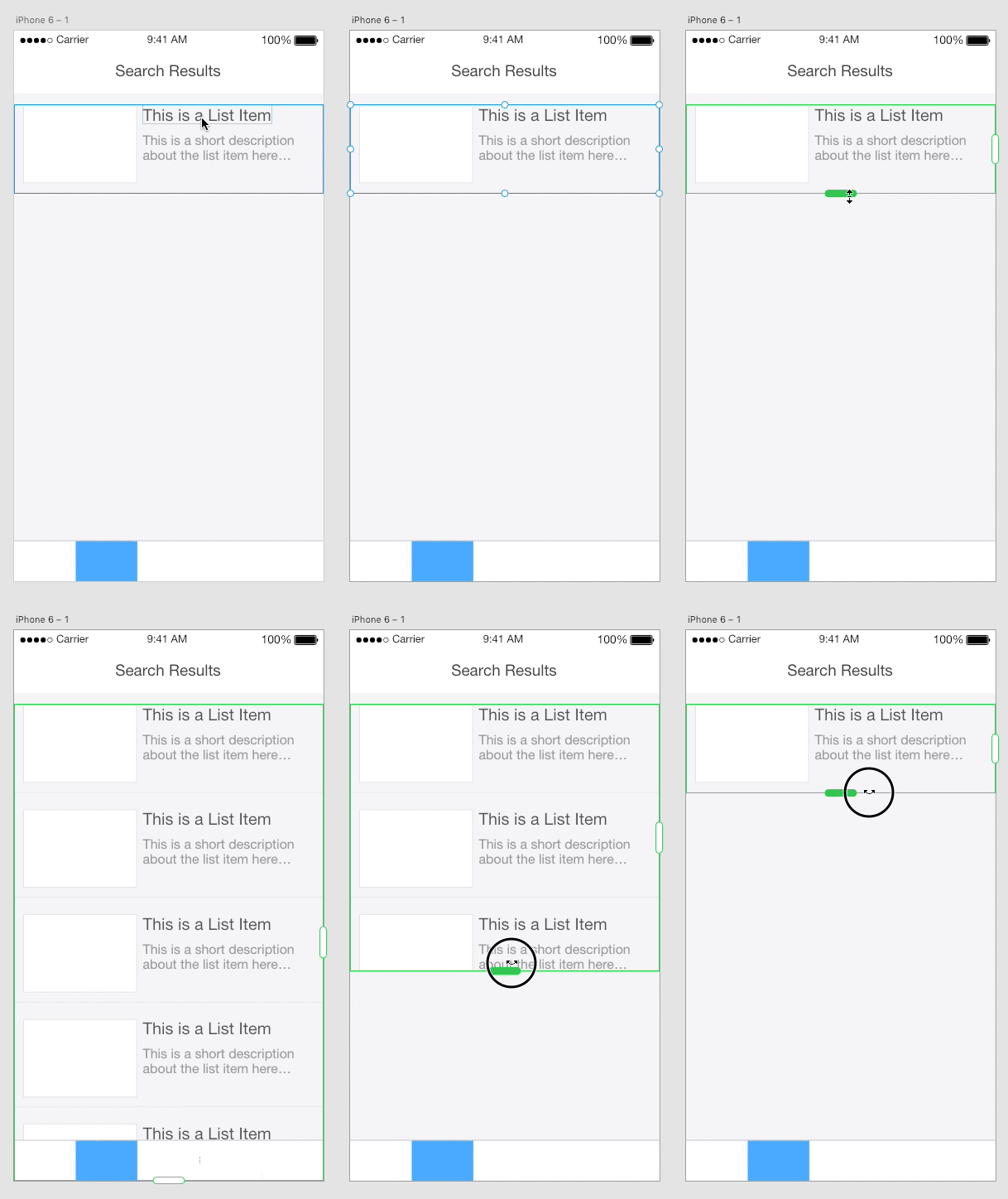
Despite everything, there are some really great things in Adobe Xd. One of them is that it comes baked with UI kits for Apple, Google, and Windows platforms. These are a few of the options on the start screen, which also allows you to easily choose some standard artboard sizes based on common devices. Another great feature is the ability to adjust the easing of the screen transitions when building the prototype. Both the length of the transition and the type of easing can be changed. Given Adobe’s experience with motion graphics in their other apps, this could give way to a really powerful animation engine. That is, of course, assuming they incorporate those features rather than just keeping this in a silo from their other products like they have so far.
There’s also some nice design features in the interface as well. The biggest win is the ability to repeat a grid as much as you’d like. This has been a big thing in Sketch for some time now, and it’s great to see it in an Adobe product. It is fantastic for designing anything with list items or any other repeating elements. Furthermore, Xd even allows you to drill into each of them to customize its text and appearance. This takes a lot of the pain out of UI design, and makes it easy to make realistic comps showing how the UI handles different types of data in the list.
TL;DR
The bottom line is that Xd is not a mature product and is unusable to me in its current state. So much work went into duplicating features that already exist in other Adobe products, while very little effort was actually put into the prototyping tools that would actually be a welcome addition to the CC. I’m not looking for a new design tool, and Adobe doesn’t realize that. Instead, they are creating tools like this to compete with Sketch. It’s obvious that this product isn’t meant for me, someone already using Adobe’s products and happy with them. This is meant as a way to get back users who are abandoning Photoshop for Sketch. What I really need is a competitor to inVision. And for now, Adobe is not that competitor. InVision has better prototyping and commenting (also a big wish for Adobe to create) and I will stick with them for now.
And as for all of these neat-o new design features? They should just be incorporated into Illustrator and Photoshop. There’s no reason to build them within a new app and not incorporate them into the flagship design apps in the first place.
Sorry, try again Adobe.
Hi There!
I'm Scott, and I love writing things like this. But I spend most of my time working as a designer.
See my work»
