The world of web design has been changing for some time now. With the increasing use of smartphones and tablets, there is a need to provide content that adapts to devices other than desktop computers. “Responsive web design” and “mobile-first” are common phrases thanks to Ethan Marcotte and Luke Wroblewski. I believe that this movement is necessary, and that’s why I’ve made sure that my own site is responsive and optimized for mobile devices. But there seems to be an aspect of the web that has remained an oversight to the mobile-first perspective.
Long before we were surfing the web on mobile devices, we were enjoying one simple, fundemental feature on those same devices — email. Why is it that something enjoyed on smartphones long before this mobile movement still remains unchanged? Perhaps it is because there is no apparent glory in email design. I would argue with that point. Email design may still be stuck in the 90s as far as HTML markup is concerned, but there is plenty of room for innovation and excellent design. It’s time to change standards. Its time to rethink how we are doing it. Nobody uses web interfaces and desktop computers as their primary source for viewing emails so lets stop designing them at 600 pixels wide.
What’s Out There
Most HTML emails are completely oblivious to providing content that is optimized for a mobile device. Instead, they give you a complicated graphic that looks like a small landing page or website. You know exactly what I’m talking about. They show up in your phone’s inbox and aren’t even legible because of the allotted screen real estate for the message. Need a reminder? Here are a couple examples of emails from Guitar Center and Papa John’s. The text is tiny, links are grouped close together, and you struggle to make the email an ideal size. This is bad design, and it has to change. Some companies seem to be aware of the need for mobile treatment but are incredibly misguided. They will provide a link that says “Viewing from a mobile device?” which will link you to a text-only webpage that isn’t even optimized for a mobile device. How backwards is that?
MailChimp has been making some recent strides to provide tools for building mobile friendly email campaigns. I’m surprised how long it has taken for them to make this move, but better late than never. They have even built a free mobile app that allows you to preview your email on a mobile device without sending a test email. It’s actually quite helpful. If you’d like to know more, read their article here.
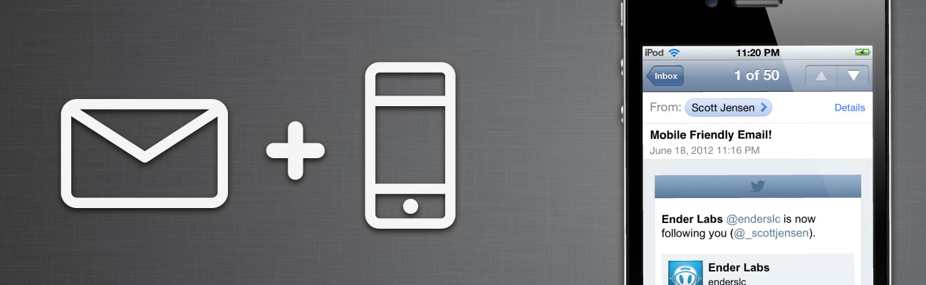
A Twitter Case Study

To illustrate my point, I put together a little case-study for a redesign of the twitter notification email template. Why Twitter isn’t already doing this, I don’t know. They don’t even have to go through the process of omitting content. The emails provide clear, upfront information. It is simply a matter of rethinking the form.
It starts by changing the standard email design size. We know that 600px isn’t going to cut it anymore. The virtual pixel size of the iPhone is 320px wide, while the portrait view of the iPad is 768px. We want our email to look good on both of these devices, so we are left with two options. Either we can start with the lowest common denominator – the iPhone – and design our email to fit within a 320px boundary, or we can do something much more interesting — make the design responsive.
To do this, the code is actually quite simple, especially if you are familiar with the principles of responsive web design. We start by designing the email for a maximum width. This is a restriction on the size that you want the email to display at. It won’t apply to a smaller device like the iPhone, but it will keep your email from being over-scaled on larger devices like the iPad. I prefer to keep this width somewhere around 400-500px. Set this parameter on your code by using a <div> with the css property of max-width:
<div style=”max-width:400px;” >
</div>
This is basically your wrap element for the design. Next, you will nest a <table> inside and set the width to 100%:
<div style=”max-width:400px;” >
<table width=”100%”>
</table>
</div>
Lastly, be sure to use percentages when declaring widths in your code. This is especially important on images, as it will allow them to scale to fit the appropriate areas. For example, if you have a header image that is spanning the entire table, set the width in css to 100%:

<div style=”max-width:400px;” >
<table width=”100%”>
<tr>
<td>
<img src=”header.png” style=”width:100%;” />
</td>
</tr>
</table>
</div>
And that’s it! Make sure you stick to the other best practices for HTML email markup, and test your designs plenty. The results will be emails that look great across several devices as well as through web interfaces and desktop clients. On top of that, your users will be able to easily digest and interact with your content.
A Few Last Thoughts
Obviously, this article isn’t for everyone. The majority of the email campaigns that I design for are built around iOS app content. That alone narrows down the user base that I design for. It means that I am primarily concerned with how the emails will look on iDevices over other interfaces. While these emails should appear fairly correctly across other email clients, I haven’t done testing for some of the ones that I don’t care about (Hotmail, AOL, Outlook, etc.). If you are creating enterprise email templates or sending to a wide variety of users, this might not work for you. At least, not yet.
Hi There!
I'm Scott, and I love writing things like this. But I spend most of my time working as a designer.
See my work»