Ok, I’m sure you’re tired of reading articles and hearing conversations centered around the three small lines of the hamburger menu. Is it a bad UI pattern? Is it ok? Well, this isn’t a post about whether it’s good or bad. The fact is, I believe it’s a poor design decision, take it or leave it. But here’s the problem – the hamburger menu does have some strong advantages, especially when used in mobile design where pixel real estate is tight. So what can we do? Just accept the hamburger menu, despite its negative consequences, and move on? A lot of apps and websites seem content with that decision. I feel like we can do something better.
Before we get too far down the rabbit hole, I want to tell you what brought me to this opinion in the first place. Several months ago, I actually had no beef with the hamburger menu (see what I did there?). In fact, I viewed it as a progression in mobile navigation UI. Something that was bound to become a standard. Plenty of prominent sites and apps were adopting it, and if it was good enough for them, it was good enough for me.
Then two things happened that shook me out of my indifferent opinion. First, I came across this great article. If you haven’t read it yet, do yourself a favor and read it. Go ahead, I’ll wait for you to finish. It’s an article that really dives into the consequences of using a hamburger menu. Namely, sites that implement it see a significant loss in user engagement. Seeing hard data like this resonated with me and began to change my mind about the hamburger menu.
If someone this smart has a problem navigating it, what does that say about a typical user?
The next incident involved an interaction I had watching a colleague try to use a new webapp that happened to utilize a hamburger navigation menu. He was a developer and extremely familiar with the hamburger UI, but when it came down to using the app for what he needed, he actually said out loud “How do I get to that?” Keep in mind, this is one of the smartest people I know, and he didn’t even think to try the hamburger menu. If someone this smart, this familiar with that type of UI has a problem navigating it, what does that say about a typical user? My opinion had officially found a solid foundation.
Finding a Solution
So enough about why I don’t believe in using the hamburger menu – it’s time to talk about a solution. To do that, I looked at the specific benefits to using the hamburger menu:
- Scalability: This is probably the biggest benefit and the reason so many sites and apps choose to use it. You can fit a lot of navigation when you tuck it behind a drawer.
- Tidiness: This is related to scalability, but it’s not the same. There is a desire to keep designs neat and tidy and leave room for the main content of a design. Using a hamburger menu gives designs an overwhelming sense of visual simplicity that will be attractive to any designer.
And if there is going to be an alternative to the hamburger menu, it needs to somehow solve the problems associated with it:
- Discoverability: Features and specific items in the navigation should be easy to find and discover for users, especially users that are using the product for the first time.
- Engagement: The UI should provide hints and feedback to what a user can do within the product, and prompt them to use those features by surfacing them in the UI.

The Hard Part: Mobile
I decided to start with the hardest problem and see if a solution could come out of the mobile-first approach. After a lot of ideation, I came to terms that the iOS tab bar menu was actually one of the best solutions for mobile. Plenty of people have tried to make this work by making the tab bar scrollable (fitting more than five options in it) or by providing a “more” tab to tuck other miscellaneous options under. But a scrollable nav feels weird, and putting “more” in your nav is like a hoarder with a spare bedroom – eventually it will get filled with garbage. Also, both of those options still suffer from a lack of discoverability. So what can be done to the tab bar menu to make it scale past five items?
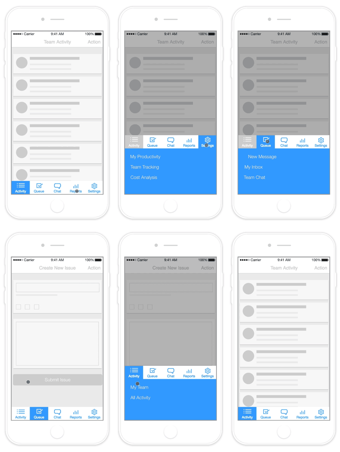
My solution came from imagining how the two UI patterns – hamburger and tab bar menus – could be combined into the same approach. The result is a tab bar control that brings up a drawer of options related to that menu item.
I’ve made up a fake team productivity app to illustrate how this could work. By using this approach, the user can still clearly see the main features and uses of the product. And rather than being bombarded with a full list of nav items in a hidden hamburger menu, they are only shown a handful of choices that are related to the tab they tapped on. This makes the navigation easy to consume, keeps it discoverable, and also allows the user to understand hierarchy within the app.
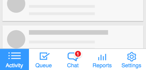
Another benefit to this type of design is the ability to keep contextual notifications. If you are trying to use notifications with a hamburger menu, you have one place and one place only to show those notifications. Keeping a tab bar layout allows you to prompt the user with notifications for any of the particular menu items.

Of course, the biggest win to this UI is its scalability. Yes, it will still force smart decision making for the IA of the product or site, since you are limited to five categories, but that is a good thing. Honestly, I think just about any site can be fit into five categories if the designer is smart about it. But beyond that, each of these categories can have five to six sub navigation links. This allows an app to scale up to 30 navigation options without feeling overwhelming to the user or without destroying the screen real estate market.
Scaling Up to Tablets
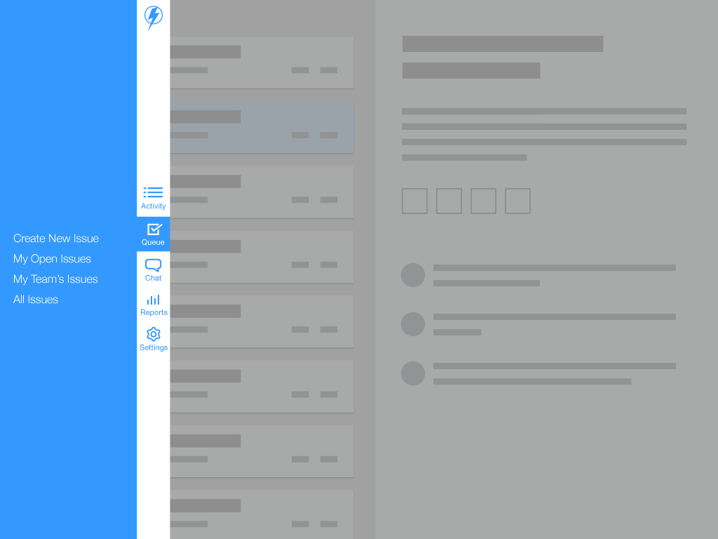
Simply implementing this tab bar on a tablet felt a little weird. Tablets have a lot more width to work with, and using this exact UI felt like an awkward teenager that hadn’t quite grown into his clothes yet. So I took it another direction (literally, ha!). Instead of putting the tab bar on the bottom, I went with putting it along the side. This was a better way to utilize the screen, and felt really natural. As an added bonus, most people hold tablets on the sides, so this is prime real estate for thumbs that are just waiting to take action.

What About Desktop?
Brace yourself… flyout menus. That’s right – scale this thing up to a desktop experience and you’re met with an undeniable reality: this UI isn’t anything new. Flyout menus have been used on the web for years, and just about any user (even your mom) knows how they work. That’s the real beauty of this UI – it really is nothing new.

Full Disclosure
I don’t know what to call this thing. A tab drawer? The TABurger menu? the garden burger menu? Furthermore, I don’t know if anyone else has built or designed something like this before. With how simple it is, I can’t imagine that I’m the first. I know there are a few apps that use flyouts on some of their tab buttons (like Tweetbot, for example), but those are usually built as shortcuts for power-users rather than augmenting the navigation hierarchy. If there is an example like this out there, feel free to let me know, and I will happily append this post.
Whether this is something new or it’s something that’s been done before doesn’t really matter. What does matter is that there are better, more creative solutions to navigation than the hamburger menu. Stop telling yourself “well this super duper website is using it, so it must be ok,” or “Everyone is doing it so it will eventually catch on.” You know what else “everyone-is-doing-so-it-must-be-ok?” Mediocrity. And design deserves better than that.
UPDATES
Collin Eberhardt pointed out on Twitter that a similar UI is utilized in the Windows Phone. I’m actually a Windows Phone user myself (*gasp!*), and he is right. However, WP only uses this type of interaction for their “more” option in the tab bar.
James Perih passed along another example on Twitter where someone else has implemented a similar solution. Take a look at the AHTabBarController by Arthur Hemmer.
Manuel Rauber implemented a great version of this nav concept into a sample app and put the code on Github.
Hi There!
I'm Scott, and I love writing things like this. But I spend most of my time working as a designer.
See my work»
