Category Archives: Uncategorized

Enterprise Application Redesign: From the Bottom Up

Enterprise Application Redesign: From the Bottom Up
This article was originally posted on sitepen.com

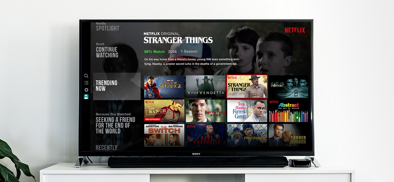
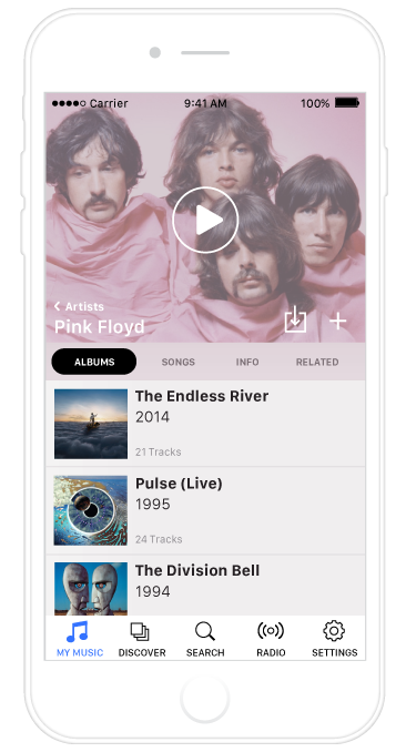
Not long ago, good design was considered nice to have, but non-essential to a product or company. In today’s market, however, good design has become a commodity. The apps we use on our phones, our laptops, or even on our TVs are constantly scrutinized based on their quality of user experience design. Gone are the days when a good UX wasn’t necessary. Today, we all expect the software we use to be easy, straightforward, and elegantly simple.

This shift has proven difficult for large enterprise organizations to manage. Their products are used by hundreds, if not thousands, of users daily and are supported by diverse teams of developers, project managers, designers, and business stakeholders — many moving parts, to say the least!

For large organizations, improving their user experience is not a question of intent, it’s a matter of logistics. It’s easy to criticize a company whose product has lagged behind consumer market trends. But in reality, changing a large and complex product is like redirecting a large ocean liner. It can be done, but it takes time, planning, and getting everyone on-board (pun!).

Starting at the bottom

So, how does an enterprise organization go about improving their UX design? Mentioning a redesign is sure to cause a knee-jerk reaction of a resounding “NO” from anyone at the table. “It will take too long”, “we can’t afford the effort”, “we don’t have the resources”. And truthfully? All of those responses would likely be accurate. But there is another way to achieve a redesign that doesn’t require the effort and cost of a complete, top-down overhaul of the product — start from the bottom.

A bottom-up redesign is a safe, efficient way to improve your product without being disruptive to product development or other long-term objectives. It allows you to compartmentalize the redesign and work in small steps towards the big, end goal — a consistent, fluid UX that makes your users happy.

Divide and Conquer

diagram

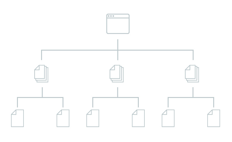
So how does it work? The first step is to plan the redesign by dividing the application into small, easy-to-work segments. You can go about this any way that makes sense for your product and organization. Depending on your resources and how teams are distributed, the scope of these segments will vary. Here are a few ideas:

  • A single page or view such as a dashboard or confirmation page
  • Experiences within the app such as the checkout experience
  • A single use case in the app, start to finish
  • A persona or type of user of the product
  • An entire app within your suite of product offerings

Remember, it’s easier to start small, so be conservative when you divide your product into these segments.

Next, make a plan for the sequence of the redesign. This is where the real magic of this strategy comes in. Choose the sequence that falls in line with the current product roadmap. Is the user permissions page part of the next milestone? Great, go with that. A completely new application? Super, put that on the list. Making your redesign match the sequence of the product roadmap ensures that resources are spent more efficiently. Two birds with one milestone, you might say (I’m here all week, folks).

Once you’ve decided on how to divide and sequence the redesign, get to work! Improve the UX of each small segment as much as possible, with an eye on the overall goal and the entire product. Use modules and design patterns that improve the experience while also being flexible for reuse within other segments of your redesign.

Survival of the fittest

Some ideas will be bad — embrace it. As the redesign moves from segment to segment, some things will work well and transfer over, and other design decisions will not. It is important not to focus too much on perfection. This is an advantage in a bottom-up redesign; even if something doesn’t work, it is easy to discover and quickly learn from while only affecting a small user base.

Since you’re not fretting over small details, the work will be faster and allow for experimentation and surprises to happen. That’s how evolution works. The redesign is like a living organism. Allow what works well to spread and inform other portions of your product while forcing the less effective work to be isolated and overtaken in the future.

A bottom-up redesign is a great way to accomplish positive change for your users and overall user experience without the headache and risk of a complete design overhaul

Make it happen

A bottom-up redesign is a great way to accomplish positive change for your users and overall user experience without the headache and risk of a complete design overhaul. Whether it is a highly-used product, or an integral internal tool, improving the UX should always be a priority. By biting off small pieces and moving throughout the entire product, it allows for strong design to grow organically while immediately driving results in user happiness.

Thinking of deploying a bottom-up redesign? Before you get too far down the rabbit hole, here are a few tips that will help you get started and ensure things run smoothly:

Appoint a leader

To be effective, any redesign should have a leader who can communicate the vision and follow it throughout the whole process. This should be someone who can comfortably work with all kinds of stakeholders: developers, designers, marketers, customer representatives, etc. They will also need a strong eye for design and usability. Usually, this will be a product manager, creative director, or other leader who understands the big picture.

Document design guidelines

As the redesign progresses, you will see several patterns and components that are flexible and reusable. Use these elements to begin documenting design guidelines. Having a design guide is a great way to communicate product vision to the entire team. If something is working really well, documenting it in your guidelines allows for other teams to incorporate it even if they aren’t yet part of the redesign. The best ideas will start to bubble up through the organization with very little effort.

Hire out

Many times it is best to look to an external source to accomplish a redesign. In doing this, you can find an objective partner who can follow the work as it moves from team to team or product to product. The external partner will likely have more experience with what makes a redesign process succeed, and will have the right, skilled resources to dedicate to the effort. Be sure to select a partner that is a good fit for you and your company, just as you would when choosing a development partner. Outsourcing a redesign has all the advantages of hiring an entire internal design team to work on the redesign full-time, without the overhead and potential hidden costs of full-time employees.

Scott Jensen

Hi There!

I'm Scott, and I love writing things like this. But I spend most of my time working as a designer.
See my work»

Less Clicking, More Binging

Less Clicking, More Binging
This article was originally posted on sitepen.com

Whether it’s Game of Thrones or an old season of Rupaul’s Drag Race, it’s pretty likely you’ll be streaming something tonight from your TV. Netflix, Hulu, Sling — these are the apps that dominate our quiet evenings. And while many of us don’t consider them apps, they are services that we consistently interact with on a daily basis. But despite how ubiquitous these apps have become in our lives, there is one thing they are getting wrong — the user experience for navigating content.

Video streaming services, especially on the TV, are lagging behind in UX design. Despite everything that we’ve learned as the web and digital world has matured, fundamental mistakes are being made constantly in the world of set-top boxes.

Netflix and chill click

If you build something for the web or mobile, clicks and taps will invariably be a part of the UX discussion. “How many clicks does it take to do this?” “Can we eliminate taps to make this feature more discoverable?” Questions like these are important; the fewer contact points required from the user, the more likely they’ll have a successful experience with the product.

But in the world of steaming video from your TV, this metric seems to be overlooked entirely. Think about this the next time you’re trying to *click* find *click* something *click* to *click* watch *click* on *click* Netflix. Your experience has been reduced to this:

browse-3

The shear fatigue of the experience is overwhelming. It’s comparable to walking into a Blockbuster (yeah, remember those?) and picking up one movie at a time. Can you imagine how long it would take to find something? And yet that’s what these apps expect from the user. The UI, while it might seem filled with beautiful content, is forcing you to make dozens of clicks, browsing one item at a time.

The underlying issue is simple, though not obvious: these interfaces rely on lists to browse content. Episodes, channels, movies — they are all presented to the user as lists. And why shouldn’t they? If this was a web app, this decision would make perfect sense. Most of the apps we use on the web and our mobile devices are built around lists.

The problem is the remote. This isn’t a web app. It’s meant for TV, and TV apps don’t have the luxury of complex user input devices (mouse, trackpad, touchscreen). Even the remote for the Apple TV isn’t a natural substitution for those inputs. Scrolling simply isn’t a thing in the world of TV UI. Users are forced to rely on a D-pad and a couple of menu buttons. That’s it! And yet video apps are being designed without adhering to this constraint. They may look beautiful (looking at you, new Hulu design) but they are ultimately not user-focused. And when the user is forced to take a back seat, so will engagement; it’s a lose-lose situation.

Utilizing the Grid

So what can be done? The best way to alleviate user fatigue is to find ways to serve more content/choices with fewer clicks. Why pick up one movie at a time when you can browse a whole shelf? Move away from lists and serve content using grids instead. With a grid, the user can click through rows of content, allowing their eyes to consume more while their thumb clicks less.

Some of the apps use this concept already, but only on ancillary views. These views are harder to find, and not usually sought out by the user. Instead, the entire UI should be built around serving up content in a grid right from the start. To illustrate this, here’s a basic prototype:

(Click on the window to activate the prototype, then use your arrow keys to navigate)

This accomplishes a few things well:

  • It allows the user to move through much more content with only a handful of clicks. Clicks between categories deliver 12 shows at a time, and clicks inside of the categories deliver 4 per row.
  • Since this surfaces more initial content for each category, it also allows the user to browse at a high level before committing to an entire category. You’ll know whether “Independent 90’s movies featuring a female protagonist” is actually a category that looks interesting.
  • It keeps higher level nav items visible and easily accessibile. No more endless clicking back to the top to find the search.

The solution is not without challenges, and this example’s not perfect. But I’m also not on the Netflix payroll. A few design cycles could iron out most of the remaining pain points to make this experience feel completely natural. The bottom line is that there are clearly ways to improve the experience, and TV apps should be pushing those boundaries rather than settling for what they’ve built elsewhere.

The Series Finale

But let’s be honest, most of us aren’t building apps for TV on a daily basis, so what’s the bigger takeaway? A good user experience is built on acknowledging constraints rather than ignoring them. Whether you’re building a new app or translating a product to another platform, question everything. It might not be a problem with using lists, but it could be that rudimentary. Even the most typical conventions and design patterns might be the very things that confound your users. Always design it from their side of the screen.

Fade to black, roll credits.

Scott Jensen

Hi There!

I'm Scott, and I love writing things like this. But I spend most of my time working as a designer.
See my work»

Out of the (Drop)Shadows

Out of the (Drop)Shadows

To say that I was disappointed when Apple released iOS7 in 2013 is an understatement. To be on-trend, Apple had flattened their entire UI without any real reinforcing principles. This came with countless oversights to the user’s experience which took a backseat to dropping skeuomorphism. It was flat for the sake of flat. Compare this with Google’s Material Design which came shortly after. Material embraced flat design with a specific opinion — mimicking real-world materials. This immersive design language incorporated the flat look while also maintaining depth. How? By using big, soft drop-shadows.

Just looking at the two design languages, it’s clear that Material took the better approach. Even putting aside the rich animations, Material Design provided a cleaner user experience that was also forward thinking and visually appealing. It was flat, but with the important compromise of shadow. This small compromise allows Material to maintain depth and look more polished. Even Apple seems to think so; they’ve been subtly letting drop shadows slip into their UIs ever since.

And now Microsoft, who were flat before flat was cool, have announced their new design language: Fluent Design. It looks great, but it also looks extremely trendy — big, soft drop shadows.

It is strange that the drop shadow is a visual relic that has managed to cling to UI design for decades. It doesn’t matter what the design patterns of the day embody, drop shadows are our go-to crutch for creating depth. But why? Does it need to be that way? Can an opinionated flat design still have depth and truly be free of drop shadows? What would that even look like?

A Different Approach

The fact is, we are surrounded by a world that is full of depth, and very little of it is defined by shadow. If we are going to replace drop shadows in our visual UI metaphors, we should look at other options that create depth in the world around us.

So how do we perceive depth when shadows aren’t involved? There are a couple easy answers. Scale is the most obvious solution — big things are nearby, small objects are far away. Linear perspective is another, using an objects dimensionality to recede into space. But for either of those approaches to be really effective it would require a 3D environment. Building a two dimensional UI around those three dimensional principles would feel gimmicky and distracting. Until AR and VR are more commonplace, that’s just not an option.

paul-gilmore atmospheric perspective

This lead me to another, lesser known type of depth perception. Atmospheric perspective is the phenomena where the atmosphere between the viewer and an object shifts the value and hue of the object. The further away the object is, the more atmosphere and the stronger the effect. If you look at a distant mountain range, you’ll know what I’m talking about. Utilizing this principle is a common technique in painting and art. I was first introduced to the concept when studying traditional Japanese landscape ink paintings. If you want a more recent example, pick up any video game art book and you’ll see it being used heavily in their environments and landscapes. So what if we took that concept and applied it to UI design? I decided to explore the possibilities for myself.

Creating the Effect

As a proof of concept — and a small side project — I took it upon myself to see if this could actually translate. But before any UI elements could be built, I needed to create a basic formula for simulating the effect. I wanted to approach this as a big picture concept to see if it could support an entire design system, not just a few screens in a single app. First, I broke down the effect into three core components: The content, the atmosphere, and the hue.

atmosphere-effect2

Content

This represents the actual object, whether it’s a photo or a button in the UI. It is the object with full exposure and correct color.

Atmosphere

This layer represents the density of atmosphere between the user and the object. It specifically affects the object’s value by muting the tones. Whites are less white, blacks are less black.

Hue

This layer only shifts the hue of the object, including the atmospheric layer beneath it. In the real world, this color shift relates to the color that is being reflected in the atmosphere. Often it’s blue for the same reasons as the sky, but it can be any color that becomes predominant in the light. In a sunset, for example, the colors become more orange and red. To mimic this flexibility, this layer would take on the color of another object in the UI — a background image, maybe a cover photo — and would serve to shift the hue of all other elements within that view.

scale

Creating Increments

But creating the basic effect was only the first step. If this was going to be used to simulate depth, that meant it needed multiple levels or increments. Furthermore, I wanted to use a standard when creating my designs and not just eye-ball each screen to ‘what looks good.’ So I developed a basic 10-step system to represent different layers of depth that were possible in the design.

The big takeaway here is that objects do not approach the ends of the value spectrum like they do when using typical overlays or shadow. Overlays simply darken all of the elements, pushing them closer and closer to black (or white, if it is a white overlay). In the atmosphere model, objects actually approach a middle-of-the-spectrum area. This means that blacks and whites become less clear and more muted.

This creates a big opportunity for contrast, which is very important for simulating depth. If you design your foreground at a level one, with a background at a level six or seven, you’re actually free to use a broader range of bold colors and values. Use black text. Use white text. It will have the contrast to stand out, giving the designs more flexibility.

Incorporating a User Interface

music-iphone-mockup

After working through this it was time to put the concept to a test by applying it to a UI. I decided to go with a music app, because hey, the world really needs one more music app design, right? Honestly it was just an easy place to start. Using a basic design, I broke the UI into several groups and then applied the atmospheric system to each of them. Interactive elements like the tab bar and play controls were kept at level one, while backgrounds and subordinate elements were pushed back into other levels. The cover photo was used as the color influence, giving the entire view a subtle influence of pink hues in the example.

Exploded2

The result? The system worked. At least, it did in my eyes. Maybe you’re thinking, ‘Nah, that design looks all washed out and muted.’ Really, it looks great on an actual device. What surprised me the most was how my eye naturally found its way through the UI. The interactive elements seemed to pop, making them easy to find and focus on. The other elements receded in space, still providing context and depth. And the best part?
Not a single drop shadow needed.

OS-Level Design Systems

I decided to push the concept further. Could an entire design language be based on a principle like this? What would system-level interactions look like if they incorporated atmospheric perspective to distinguish themselves from app-level elements? What I found is that the OS level is really where a concept like this would shine. Multi-tasking, notifications, control center — these are all things that require a concept of depth to break the chrome of other apps being used on the screen. This is particularly important on mobile, where an app is allotted the entire screen real estate.

multitasking2
notifications2
control-center
lock-screen2

Obviously a desktop OS doesn’t suffer the same needs of a mobile UI, but there is no reason this concept wouldn’t scale up to work for a larger screen. It would be particularly useful to solve one specific problem — drop shadows to distinguish separate windows. No matter the platform, that is one problem no one seems able to get around. Using an atmospheric model, inactive windows could be pushed back in space. This would keep them entirely visible for reference, while making the active window perfectly clear to the user. It might even be easier to stay focused.

macOS

So there it is — a flat visual system that can still utilize depth without compromising its flat-ness. Overall the experiment was a success, and something that I would love to see included in a design system. It would be great in a single app, but would really stand out if someone like Apple used a concept like this to opinionate their design.

A Few Last Notes

These designs aren’t baked. They aren’t ready to be deployed to millions of devices around the world. They’re pretty rough and include plenty of oversights. I know that. All of this is simply a proof of concept and the result of one designer going through some self-imposed explorations over a few nights and weekends. I’m not an entire team, and I wouldn’t pretend to be more capable than any of the folks at Apple, Google, or anywhere else. There would be countless other considerations required in order to fully realize a concept like this, and the system itself could use a lot more fine tuning. My goal was to discover whether that potential even existed. In my opinion, I believe it does.

Will drop shadows ever disappear from UI? Probably not. Despite this proof of concept, I will still be using them frequently. I’m even using them on this very website. In a perfect world, a UI concept like this would likely still incorporate drop shadows to push it even further. I simply chose to challenge myself by avoiding them completely. The point is, there is a big visual world outside that our eyes naturally understand. As designers, we have a lot of tools at our disposal for translating that world into an interface. There’s no need to always stick with what has been done in the past.

Lastly, I’d love to hear what you think! Send me a tweet and let me know.

Scott Jensen

Hi There!

I'm Scott, and I love writing things like this. But I spend most of my time working as a designer.
See my work»

The Stepford Wives – Alexa, Cortana, and Siri

The Stepford Wives – Alexa, Cortana, and Siri

Yesterday, an interesting article by Mandy Brown caught my attention. It focussed on the lack of originality that exists in the current world of artificial intelligence. The article resonated with me because I’ve long felt that our mainstream AI bots like Siri, Cortana, OK Google, and, the recent, Alexa have a blatant heavy-hand on gender roles. Why do all of these digital assistants need to be women? For all the progressiveness we say we’re trying to uphold, we have created these assistants in the image of a 1950s secretary.

All of these AI bots are akin to the Stepford Wives – affable, identical, and quite frankly, boring.

The article delves into a much deeper side of AI philosophy and why we even insist on modeling AI in a personified manner. I agree that a text/voice based UI is not the future. It is a thing, but it is not the be-all, end-all of UX design. But that’s not really the point that I’d like to focus on.

What strikes me, is the lack of personality in the space. It seems that these companies – Amazon, Google, Apple, Microsoft – for all of their technology and resources, haven’t realized the shear diversity that can be reached in the field. Instead, they are all banging middle C on the piano, expecting us to choose the better composition. All of these AI bots are akin to the Stepford Wives – affable, identical, and quite frankly, boring.

The Possibilities

So where can we find examples of this greater range of diversity? In movies and science fiction, of course. There are an immense amount of examples that show the true range of personality that can be incorporated into an AI. In the aforementioned article, Mandy Brown outlines some of these that differ on a philosophical and ethical level – I’d like to talk about personality, because that’s what makes a brand, well, a brand.

Mr. Mom

You might be saying, “But people probably prefer a woman.” Just stop. Your assumption is what has lead to our lack of creativity and it’s the source of the problem. Looking through examples, there are plenty of man-bots that audiences have grown to love. Jarvis from Iron Man is one of our latest examples; a somewhat sassy bot that uses an English accent to charm his end user. Marvin, from the Hitchhiker’s Guide to the Galaxy, is another great example. He seems real because he suffers from the human ailment of depression. Surely he can’t just be a bot, if he feels manically depressed all the time.

bb8

Beeps and Bops

Who says it even has to be a voice in the first place? Look at the amount of personality and realism that is conveyed in R2-D2 and BB-8, arguable the most beloved droids in the Star Wars universe. Addressing AI from this angle would have challenges, sure. But it would also have advantages. The companion would feel more like an adorable pet. It would transcend typical verbal language. It would be able to behave *differently* than a human without feeling inauthentic. Users would be forgiving and understanding if it got something “wrong” or didn’t quite understand. All of this would feel more aligned to what AI really is today – a non-cognizant entity, pre-programmed for certain tasks and responses. Having this alignment would actually make the bot feel more real.

BMO Dance

Children and Gender-Neutrality

Of course there is another way to account for a bot not being perfect – giving it a more naive nature. This could be done by incorporating a childish personality where gender really isn’t a defining characteristic. One of the best examples of this is BMO from the show Adventure Time. Another beloved bot, BMO loves to have fun and play games and has an irresistible charm because of his/her innocent perception of the world.

Imagine that any one of the main-stream AI bots incorporated a personality more like these examples. How much more would that company’s products stand out? How much more would users fall in love with those digital companions? Switching platforms might be more like moving away from a childhood friend, and it would create some strong brand allegiance to the platform.

Will we see anyone actually try this? Maybe. I guarantee that the company that is brave enough to try will be the one that everyone remembers – and that’s never a bad thing.

Scott Jensen

Hi There!

I'm Scott, and I love writing things like this. But I spend most of my time working as a designer.
See my work»

The State of the Hover State

The State of the Hover State

Mobile UI design has been at a severe disadvantage to designing for the web for one prominent reason: discoverability. Web designers (and even desktop app designers, for that matter) have the advantage of using hover states to train their users on interaction in their designs. Hover states are used to convey clickable elements, use different cursors to hint at the type of interaction required, and even reveal additional menus/features based on the cursor’s proximity to certain areas of the design. It’s a great way to make a UI more powerful.

With the mobile-first movement, there’s been an effort to focus less on hover states in UI design. Since mobile users don’t have the luxury of hover, designers have to design to that lowest common denominator. But the good news is: technology in touch interfaces is finally catching up. Microsoft is leading some experiments that showcase a powerful new way to enhance touch UI. Take a look at their Pre-touch sensing demo:

Ahem. You still there? Go ahead and wake up, the video is over. You’d think they’d put a little more showmanship into the video for how amazing this really is. This could, in a very real way, change how designers create mobile UI. The video just scratches the surface of what’s possible. Hidden menus, drawers, UI that doesn’t have to look interactive – it can all become possible on mobile. And as far as the user is concerned, they will have a more immersive and smarter experience that requires even less taps to get to what they’re looking for.

Honestly, this is the type of tech that I would expect Apple to be innovating. Sadly, they think they have better things to be working on.

Scott Jensen

Hi There!

I'm Scott, and I love writing things like this. But I spend most of my time working as a designer.
See my work»

Putting Your Dribbble Likes to Work

Putting Your Dribbble Likes to Work

If you’re anything like me, you frequently come across amazing shots on Dribbble, you like them, and then, before you know it, you’ve forgotten about them. That’s the end of the story. The shot gets buried in your account history, likely to never be seen again. I’m a big believer that creative inspiration is usually found in others’ creative content, and I decided to actually make something happen with those Dribbble shots.

Remember screensavers? Just like payphones, those long-ago hallmarks of box monitors are relics of obsolete technology. But that doesn’t mean a screensaver has to be useless. My office and desk are surrounded by things that inspire me or push my imagination, why should this big black rectangle (or two of them, rather) sit on my desk without anything inspiring to offer?

So rather than just liking something on Dribbble (or anywhere, for that matter) and then forgetting about it. I now follow that like with a right click > save image. That image goes inside a Dropbox folder shared between all of my computers, and I set OSX’s “Shifting Tiles” screensaver to sync with it.

dribbble-screensaver

The result is an ever-growing, personally curated source of inspiration that I see every time I sit down to work or spend time on my computer. It’s similar to Underbelly’s Apple TV screensaver, but it’s only shots I care about and doesn’t break any TOS agreements since the images aren’t being republished anywhere. It’s a pretty simple solution and a much welcomed addition to the office decor.

Scott Jensen

Hi There!

I'm Scott, and I love writing things like this. But I spend most of my time working as a designer.
See my work»

What I Think of Adobe XD

What I Think of Adobe XD

When I learned that Adobe was building a new product that was focused around user experience design and prototyping, I was thrilled. Back then, it was under the code name of “Project Comet.” I’ve been anxiously awaiting it for quite some time now. But before it was released, I found out it wouldn’t be just focussed on UX and prototyping – it would also include design tools baked into it. That might seem like a good thing, but to me, it was a bad sign:

twitter

This was concerning to me because it meant that the feature set would be split between two different approaches. Thanks to Adobe, I already have great apps for creating designs. Illustrator and Photoshop are incredibly powerful, and between the two of them, I can create designs for just about any media. If Adobe Comet was going to try to be a design app, it was likely it wouldn’t support the feature-rich design process that I already enjoy in Illustrator. But I took comfort in a reply from one of the project managers from Adobe:

Twitter

Ok. Adobe has done a really great job at making their apps work together. I’m sure when Project Comet comes out, it will have some awesome import/linking options for Illustrator and Photoshop files.

No, I Was Right – It’s Unusable

Adobe officially released project Comet and called it Xd (Experience Design). And after a couple of weeks of working with it, my fears for the product have been completely realized. Xd can’t decide what type of app it wants to be. Is it a design platform? Is it a prototyping tool? It is as if Sketch and inVision got a little tipsy one weekend and Xd was the ugly, socially inept love child of that mistake. It is an empty app, with limited features for design and even more limitations for prototyping.

The Design Features

Before we get too far down the rabbit hole, you’re probably wondering “What about the integration into AI and PS?” Here’s your answer: copy + paste. Adobe, in their infinite wisdom, thinks that copy + paste counts as integrating two products together. If you copy a PS file, it doesn’t do anything neat like pulling in individual layers or anything like that. It’s a flattened image. That wouldn’t be so bad if you could at least link the PS file – but no, there isn’t any concept of linking in Xd. Illustrator files get a slight advantage, as they remain vectors that can be modified inside of Xd. But again, no linking, no importing, nothing.

color picker

Anyone who has used Sketch at all will notice that Xd is a blatant response to that platform. How the artboards work, the tool bar and inspector, it all feels a whole lot like Sketch and very little like Adobe. Even a lot of the shortcut keys that I’ve found standard in CC have changed in Xd. I think that was a mistake on their part. The whole app feels like it was built from scratch, reproducing or omitting design tools that already exist and that are more powerful in other Adobe products. A great example of this is the color picker. Rather than incorporate the typical Adobe picker, they’ve punted and gone with the OSX default (gotta love that colored pencil option!).

There are a number of severe limitations to the tools, as well. Type settings only allow for the selection of font size, typeface, justification, and letter spacing. No line height or paragraph options exist. There’s also no way to create gradients, and anyone used to working with those in Illustrator will miss that quick. And it pretty much goes without saying that none of the raster effects like blur, inner glow, etc. are available.

To sum it all up, here are the design features Xd needs in order for me to find it usable:

  • Gradients
  • Adobe’s Color Picker
  • Better Typography Options
  • Import/Linking to Other Adobe Files

The Prototyping Features

Since the design side of the app isn’t usable to me, I thought there might be some hope for the prototyping side. I was wrong. This portion of the app feels less than half-baked, and anyone accustomed to building their user flows with InVision will quickly abandon this product. There are only a few transitions to choose from between screens, and some of them aren’t even handled in the correct behavior. There isn’t any ability to drag and create custom hotspots on the design. Instead, you’re forced to select one of the design elements as a clickable area. That’s not a big deal if you created the design in Xd, but, as I already mentioned, that isn’t an option. Xd also doesn’t support any type of fixed headers or footers or overlay screens. All of these are givens if you’re working with InVision or Marvel App.

To sum it up, here’s what I need to use this as a prototyping tool:

  • Custom Hotspots
  • Hotspot Templates
  • More (and Better) Screen Transitions
  • Overlay Views
  • Linking to the Previous Screen
  • Fixed Headers/Footers

There are a Few Good Things

Xd UI Kits
xd-repeat-grid

Despite everything, there are some really great things in Adobe Xd. One of them is that it comes baked with UI kits for Apple, Google, and Windows platforms. These are a few of the options on the start screen, which also allows you to easily choose some standard artboard sizes based on common devices. Another great feature is the ability to adjust the easing of the screen transitions when building the prototype. Both the length of the transition and the type of easing can be changed. Given Adobe’s experience with motion graphics in their other apps, this could give way to a really powerful animation engine. That is, of course, assuming they incorporate those features rather than just keeping this in a silo from their other products like they have so far.

There’s also some nice design features in the interface as well. The biggest win is the ability to repeat a grid as much as you’d like. This has been a big thing in Sketch for some time now, and it’s great to see it in an Adobe product. It is fantastic for designing anything with list items or any other repeating elements. Furthermore, Xd even allows you to drill into each of them to customize its text and appearance. This takes a lot of the pain out of UI design, and makes it easy to make realistic comps showing how the UI handles different types of data in the list.

TL;DR

The bottom line is that Xd is not a mature product and is unusable to me in its current state. So much work went into duplicating features that already exist in other Adobe products, while very little effort was actually put into the prototyping tools that would actually be a welcome addition to the CC. I’m not looking for a new design tool, and Adobe doesn’t realize that. Instead, they are creating tools like this to compete with Sketch. It’s obvious that this product isn’t meant for me, someone already using Adobe’s products and happy with them. This is meant as a way to get back users who are abandoning Photoshop for Sketch. What I really need is a competitor to inVision. And for now, Adobe is not that competitor. InVision has better prototyping and commenting (also a big wish for Adobe to create) and I will stick with them for now.

And as for all of these neat-o new design features? They should just be incorporated into Illustrator and Photoshop. There’s no reason to build them within a new app and not incorporate them into the flagship design apps in the first place.

Sorry, try again Adobe.

Scott Jensen

Hi There!

I'm Scott, and I love writing things like this. But I spend most of my time working as a designer.
See my work»