A few months ago, I finished up on a project here at my home work station. I posted a quick photo on twitter with the intention of releasing more information about it. Well, better late than never, right? Here is my Ikea typographic desk mod. It was plenty of work, but it has definitely proven to be both useful and enjoyable.
The Hardware
It starts with a basic Ikea Galant corner desk. I went ahead and bought the side extension as well. I chose black for the top color. I figured this would give the best contrast for the white letters, and would also match the other things in my office. Next, I needed the top cover. My intention was to use an opaque plexiglass. I visited Regional Supply in Salt Lake City to see what they had available. If you are looking for sign supplies, they are excellent. The 4’x8′ sheet of plexiglass was going to put me at about $90. I probed further, and they came up with a different kind of material with the same aesthetic qualities as the plexiglass only it was half the price. Lastly, I needed the letters. To make these, I made about a 20 page PDF with several different sizes of letters. I chose to only use Helvetica Neue and Minion, and I stroked the letters in light gray. After that, I printed up about 3-4 copies of the PDF on 60# paper at alphagraphics and went to town with my exacto knife.
The Results
A few hundred dollars later, it was finished. I used a router to cut the top plastic to match the exact contours of the desk. It serves as both a clean desk top as well as a dry erase board for jotting down a few quick notes or ideas. The letter forms under the desktop look excellent. They almost appear to be luminous between the desk and the plastic.
Some Advice
A few notes if you are planning to do this yourself. The plastic top that I used, while it was half the price, scratches much easier than plexiglass. This was especially evident when using the router around the edges. Either try to protect the surface from the router, or be willing to shell out the extra $40 for better material. Also, since it’s not glass, plan on needing a dry erase cleaner to wipe the writing off thoroughly. This is something I chose intentionally; I didn’t want things to easily rub off as I worked at the desk. And lastly, I didn’t use anything to secure the plastic to the desk. You could use bolts or some industrial double-sided tape. I found that the weight of the material as well as the things on top of the desk worked well enough to hold it in place.
I'm Scott, and I love writing things like this. But I spend most of my time working as a designer. See my work»
My Printing Vendors
July 23, 2011
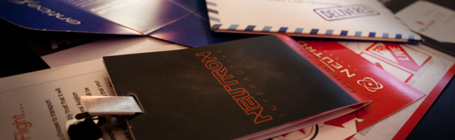
Recently, JD Skinner asked me on twitter what vendors I recommend for my print projects. I figured this is probably a good thing to share. I’ve had both good and bad experiences with printers, and it is always more useful to work from referrals rather than to try and find a good printer on your own. So, here is my list of printing companies in Salt Lake City (or online) that I use and what particular jobs I use each of them for.
These guys are located in Salt Lake City, out west by I-215. If money isn’t an issue, and I want a high quality product, I go to these guys. Andy Wayman is my rep, and he does a great job at understanding the piece before putting it into production. I use this press for the highly custom, out-of-the-box printed pieces. They have a lot of capabilities with die cuts and finishing services that you can’t always find at a smaller press. Their quality is superb.
Note: Always ask for the four color press. If it is a smaller job, they might try to run it on their digital press. This will be cheaper, but the quality of your print will suffer greatly. Generally, you can expect about a two week turnaround time, depending on the complexity and size of your order.
If I need something to look good, but don’t have the budget or need the quantity to justify going through Paragon, I use Presto Print. These guys are located in downtown Salt Lake City. They are reasonably priced, extremely fast, and very friendly. The quality is definitely not on the same level as Paragon, and they are more limited in the options that they can offer. But because they are a smaller press, they are more willing to be flexible and offer alternate solutions. I usually use them for things like flyers and brochures, especially when I only have a few days to get them produced.
Note: Expect only two or three days for the turnaround on most jobs.
These guys aren’t great. In fact, there isn’t much good to say about them. They are simply my corporate chain printer that I go to if I need something fast on the weekend or it isn’t convenient to drive to one of my other vendors. I also use them for one-offs and very low quantity orders. They are great if you are printing a few different options of something and prototyping it for approval– after that, I take the production files to an actual press. They are basically my ‘rough draft’ printing option.
Note: Do NOT do any large format printing here or anything involving foam core. In fact, don’t do anything here that will cost you more than $10. The prices for the higher stuff are completely outrageous.
If you follow me on twitter, you may have noticed a bit of a fiasco I had with these guys. It started here. You can read the whole correspondence if you’d like, they still haven’t deleted it from their twitter account. Got Print offers absolutely amazing prices on their printing services. They are an online press, and if I need something extremely conventional, (business cards, brochures, flyers, etc…) they can’t be beat. And their quality? It’s actually really good. I recommend these guys, especially for freelance work where you are required to do the print brokering. Out of the many times that I’ve printed with them, I have only had that one problem. And the reason there were so many problems was that there was a deadline and Got Print didn’t offer any easy solutions to still making that deadline.
Note: I recommend printing on their 16pt paper for almost everything. It is really thick, and a nice quality. On the downside, it will give you a turnaround time of about two weeks (including shipping time). I definitely recommend them for their prices and quality, just make sure that you aren’t under a heavy deadline. Always go somewhere in town for those jobs.
Places to Avoid
I’ve definitely had some bad experiences. Mistakes do happen unfortunately, and I am often willing to see past them. However, this is a list of places that have continued to cause more headaches and drama than they are worth.
Skyline Event Group
These guys ‘specialize’ in trade shows and exhibit booths. They are amateurs. Their production designers are clueless, they are over priced, they make TONS of mistakes, and they only work with CS3. CS3!
Kinkos
If you’ve ever gone to a Kinkos, you know exactly what I’m talking about. Not to mention the $$$
What About You?
Are you a designer? Is there a printing vendor that you would recommend? Any to specifically avoid? Let me know in the comments, and I’ll add them to the post.
I'm Scott, and I love writing things like this. But I spend most of my time working as a designer. See my work»
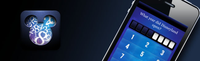
Know the Mouse for iPhone
April 23, 2011
This is one of the latest projects I’ve been working on with Zach Holmquist. It is a Disneyland trivia app for iPhone. If you are a closet Disneyland freak, this is definitely an app for you. It really will test your knowledge of all things Disney. The graphics were a blast to work on, and I’m looking forward to using the framework to build other trivia apps, so keep your eyes open for more.
I'm Scott, and I love writing things like this. But I spend most of my time working as a designer. See my work»
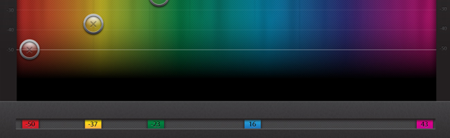
My Dribbble Shot
October 18, 2010
Apparently, I’m not cool enough for Dribbble. That’s ok, I’ll survive. But if I was cool enough, this would have been one of my recent shots. It’s another app for the iPad that I have been working on with Zach Holmquist. This is a shot of one of the settings menus that offers a color picker for advanced options. The app is going to be total eye candy, as well as incredibly useful. Let’s just say, it let’s you use your iPad when you’re not using your iPad. More to come!
I'm Scott, and I love writing things like this. But I spend most of my time working as a designer. See my work»
Eventboard App for iPad
October 4, 2010
For the past few weeks, I’ve been working on a project called EventBoard as an extra-curricular activity at work. You might call it a 20% project – yes, Neutron Interactive is awesome enough to encourage 20% projects. It was a collaborative effort between myself, Dane Thurber, and Zach Holmquist. The app has a sexy interface, and is quite handy if you can find a way to mount your iPad to the wall next to your conference room. And the best part? It’s completely free! There’s still more to come, but I’ll let the website and itunes tell you the rest:
I'm Scott, and I love writing things like this. But I spend most of my time working as a designer. See my work»
Cultivating Creativity
August 11, 2010
Creativity is a resource – you can buy it
You’re about to learn how much of a nerd I really am. I recently bought Starcraft 2: Wings of Liberty. Most people forked out around $60 for this game – I spent $100 for the collectors edition. You might ask, ‘really Scott? An extra $40 for the exact same game? Was it worth it?’ and my response is this: it will be.
Why did I do it? Creativity. As a designer, I am constantly looking for deposits of creative and inspiring material. It’s my fuel. I doubt there’s an artist out there that would dare say that they don’t owe a large portion of their success to other creative influences. It’s quite simple: creativity fuels creativity. So the question is, do we invest in creative influences?
I bought the collectors edition because I knew it would be full of all kinds of eye candy, storyline, and beautiful illustrations. Whose to say that the extra $40 won’t lead to me making thousands more on a particular illustration? Whose to say it won’t make me hone my skills to a level that lands me my next job? The fact is, we can’t see what kind of impact these things will have on our future. At least not immediately. But I’m willing to bet that each of you can look back and pinpoint very significant sources of creativity that seemed insignificant or trivial at the time you were exposed to them.
Finding creative resources
So, what else do I do to expose myself to creativity? I make a point to see good movies in the theater and subscribe to netflix. I go to concerts and visit art exhibits. I read comic books and design publications. I pay extra for good packaging, and several other things that carry good graphic design.
I know what you’re thinking. You get this through your rss feeds and the websites you visit. You’re right, those are excellent sources of creative fuel. But don’t be afraid to step outside of the box. Go to a concert. Buy a few apps simply because they look pretty. Go buy a cd – not from iTunes – buy the hardcopy and enjoy the cover art, the layout, and the inserts that are designed with it. Buy an action figure to sit on your desk. There are plenty of examples out there, and what works for me might not work for you. So explore them. Don’t be afraid to shovel out some cash for them. Don’t be afraid to rearrange your schedule for them.
The point of this post isn’t to say that I’m doing it right and that you’re doing it wrong. It’s to encourage all of us to look for sources of creative inspiration in our lives. And once we find them, to make them a priority. They are not expenses – they are investments. I would have very little imagination if it wasn’t for the thousands of legos I had as a kid. Most people would call those toys. I call them tools.
I'm Scott, and I love writing things like this. But I spend most of my time working as a designer. See my work»
Banksy & the Visual Metaphor
August 1, 2010
Visual Metaphors, at their finest, can be the most powerful forms of communication. They are made when a subject is portrayed in relation to another unrelated subject or context. These visual metaphors are all around us. They are found in the most memorable and witty advertising campaigns and political cartoons. In the case of Banksy, they are also very effective in street art.
Banksy is a graffiti artist that hails from Bristol, England. He often uses stencils to produce highly provocative imagery,usually regarding politics and capitalism. Over the last decade, he has become a sensation that has swept through contemporary culture. His work has been featured in galleries–and empty walls–around the world. However, only a select few actually know who he is. Despite his popularity, he has managed to maintain his anonymous identity. Little is known about his early history, but he has released some information through several select sources and interviews. According to his story, he began quite unsuccessfully. He was too slow at graffiti and would get caught or forced to abandon his work before it was finished. The idea of using stencils to produce detailed images efficiently came to him as he hid from the police under a train carriage and he noticed a stenciled serial number on the carraige.
He has come a long way from those humble beginnings. His work is now widely popular. He has expanded his mediums to also include sculpture and installation pieces, and several of his exhibitions have even featured animatronics. The artwork that finds its way to auctions usually walks away with a six figure price tag. He has also done artwork for several album covers and even published his own book entitled “Wall and Peace.”
How did this artist become so popular? Well, there are several factors that have played into his success. His anonymous identity has certainly had an effect. The fact that his work is usually only available for a short time because of censorship makes it rare; thus, people everywhere are desperate to grab any part of it they can. However, neither of these reasons give enough credit to Banksy’s ability as an artist. Anyone can become an anonymous graffiti artist. Cities everywhere are full of them. Banksy is more than a no name thug spray painting his name on park benches. Instead, he is an artist that has mastered the use of visual metaphors. That alone has pushed him above others in his field.
Visual Metaphors are powerful because they are images that are far from ordinary. They use two things that we normally don’t see in context of each other. Hence, they stand out in our minds. In fact, the more unrelated the subjects, the better the metaphor. But selecting two objects and putting them together is only the beginning. In order to create a lasting impression, it is important to select subjects that already carry strong meaning. For example, Banksy could have simply painted a dove on a wall in Palestine. It would have a strong message of peace. On the other hand, he could have simply painted armed guards on the wall to imply war or hate. Instead, he used both: a dove wearing a bullet proof vest. Suddenly, the image has deeper meaning. It’s no longer just about peace or war. It’s about peace under fire. It’s about peace being threatened by hate. Suddenly peace isn’t only an ideal, it’s a delicate object that can easily be killed unless we protect it.
These metaphors can be found throughout Banksy’s work. His ideas are clear and powerful. Artists and designers that learn from his example can create good visual communication. Communication that anyone can relate to. Communication that everyone will remember and be moved by.
I'm Scott, and I love writing things like this. But I spend most of my time working as a designer. See my work»
D-Box or D-Bust?
July 20, 2010
If you don’t already know, D-box is a new type of theater experience. It involves special seats that provide interaction between the viewer and the movie. It shakes, it sways, etc. The Megaplex theater at the District is the only place that you can find these in Utah. I drove an extra hour and paid about $10 more to experience this while watching Inception, which should further attest to how amazing of a movie inception really is.
‘D’ is for ‘Distraction’
Yes, distraction. Hollywood doesn’t seem to understand the root of why we see movies. It’s to escape. To project ourselves into the film and live in its story for a couple of exciting hours. Think about it. Why is it upsetting when others talk or text in the theater? Why do we like to watch movies with the lights out and the sound up? Because we don’t want distractions. The smaller the barrier between us and the movie, the better.
The D-Box seats are comparable to 3D movies. It’s a gimmick. Yes, it gets a few oohs and ahhs, but it comes at the expense of not being able to really get into the movie. It’s a constant reminder that Your sitting in a theater with other people all around.
Is it good for anything?
Yes. Like 3D, I suspect that this is a technology that has yet to be perfected. One of the others that was in the theater, Dane Thurber, made the remark that this would be excellent for video games. I totally agree. It’s not far off from a rumble pack in a controller. Video games are a media where interaction with the viewer is the goal. Something like this would add to the ‘fun’ and excitement.
As for movies, it’s not worth the extra price. I don’t expect it to catch on. Especially because the people that are willing to pay $17 to see a movie are people that aren’t impressed by gimmicks.
I'm Scott, and I love writing things like this. But I spend most of my time working as a designer. See my work»
New Site Design
July 4, 2010
A Time for Change
I created my original flash portfolio site well over a year ago. At the time, it was one of my highest achievements regarding web and interactive design. Since then, technology has begun to shift. Flash seems to be a web development tool that is on its way out the door. I believe it will still be some time before we say goodbye to flash permanently, and I still value my original portfolio as an effective and well executed design. Nevertheless, there always comes a time to change. HTML5, CSS3, and JavaScript are becoming more prevalent on the web. I also felt the need to make the site more commercial; to take the philosophical and fine art elements out and use them in channels other than this site.
Build, don’t destroy
Redesigning a website doesn’t mean destroying a brand and starting over. The identity that I’ve already established with my portfolio is effective at communicating my attitude toward design and setting myself apart from others. Yes, I could have filled this site with plenty of Web 2.0 gradients, shadows, and rounded corners, all executed using simple CSS. But why be like everyone else? Why destroy the identity I’ve already built? Instead, I chose to utilize the same motifs and style of my brand, and to limit the CSS and JavaScript to only the instances that called for it.
So, what’s new?
The result is a website that I can easily update with new content whenever I have the inkling. By building the site around a blog, I’m able to convey more of my personality and design process. The portion dedicated to my portfolio is also more extensive and better represents my full skill set. Overall, the site is more robust and more effective at letting me express myself and promote my abilities as a designer. Hope you enjoy it!
I'm Scott, and I love writing things like this. But I spend most of my time working as a designer. See my work»
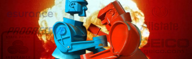
Auto Insurance Face-off
May 25, 2010
Maybe you’ve noticed, but the auto insurance portion of advertising has exploded. Seriously, watch TV and tell me it hasn’t. I see two, sometimes three, commercials from different companies during one commercial block. So, naturally, I’ve pitted them against one another. Which brand has the most effective advertising campaign?
First, let’s establish some parameters so that we can be objective.
Goal of the company:
Entice more people to invest in their insurance.
Goal of the consumer:
Spend as little on insurance as possible while still maintaining the protection that gives them piece of mind.
The knee-jerk reaction in marketing is to offer a lower price than the competition. Sometimes that works. Sometimes not. Consider your auto insurance. Low prices are great, but what if it meant you were less protected. A car accident is a terrible inconvenience. Financial repercussions can easily escalate to tens of thousands of dollars. When that’s you, when you’re staring at your demolished vehicle, you’re not thinking about how much you pay for auto insurance. You’re thinking about whether or not your insurer will take care of you while you put things back together.
If this market could be boiled down to its core, there would be one word that remained: trust. Insurance is all about trust. Trust that the company has your back when life throws a curve ball. Trust that you’ll still be ok when the unexpected comes your way. All of these insurance companies advertise low rates. But which one really goes for the deeper need for insurance? Which one goes for trust? Let’s look at each of the five strongest brands and decide.
Geico
If I told you that one of the major auto insurance companies was a gimic, which one would it be? I’d bet most of you would say Geico. The rest would say esurance. Why? When it comes to advertising, Geico takes the low road. They rely heavily on cheap gimics to give their ads humor and make themselves stand out. What’s the problem with this? Geico is confusing memorability with good branding. Yes, I can tell a Geico ad when I see it, but what is it making me associate with their brand? They’re low budget? Dry? Corny? That their CEO isn’t smart? Sure, these things get an easy chuckle, but at what expense? In the realm of auto insurance, looking like a cheap gimic probably isn’t the best idea. Geico definitely has a long way to go when it comes to understanding the needs of their customers.
Esurance
As I already mentioned, this would be another brand high on the ‘gimic scale.’ The big problem esurance faces is that it’s an online company. If I get in a car accident, who will take care of me? A website? A look at their advertising doesn’t help matters. They focus their campaign around a cartoon character named Erin. She finds herself in several strange adventures that have nothing to do with auto insurance, but somehow finds a way to make the plug. So, my insurance is a website and a cartoon character? Another example of advertising that misses the mark in hopes of creating an easily distinguished campaign. However, it seems they’re starting to wise up. They have recently launched a new campaign that shows the employees that work for them. It is a somewhat clever concept that pivots the IT Staff in the office against the Customer Service Staff. The craft could be a little better. They’re not quite Zappos, but at least it’s a step in the right direction.
Progressive
Another online insurance company. These guys are using their heads a little bit though. The advertisements focus on a physical apparition of their online store, where Flo, a very bubbly and friendly store clerk, helps people find insurance that fits their price range. They are doing several things right. One, they are giving consumers a very positive face to identify with. If Flo worked at a certain grocery store, it’s likely that I’d do all of my shopping there. Another thing they are doing right is showing their signature Progressive SUV at the end of every commercial. It’s subtle, but it tells consumers that there are actually Progressive Agents in the ‘real world.’ They also push saving money more than any of the other brands. And they accomplish all of this while still maintaining easily identifiable advertisements. So what are they doing wrong? As likeable as Flo is, it doesn’t look like she’s in charge of anything. She’s just working there part time while she goes through nursing school. She’s not going to take care of me if I need something. She just works a cash register. While Progressive is doing several things right in their campaign, this is one area they are falling short in.
State Farm
State Farm showed up late to the party. This is a company that has long been established in the market and already has a huge customer base. Seeing the other companies explode on the advertising scene must’ve made them more than a little nervous; they decided to act. They don’t face the obstacles of online business or of being a young company. So what did they do? In my opinion, they looked at the advertisements of their competitors, selected the most effective one, and then tried to replicate it for themselves. What we get is a man in his early thirties who walks around in ordinary settings and talks about trusting people and finding easy ways to save money. It’s a very good attempt at a campaign, but take a look at their spokesman. They fall into the same trap as Progressive. This guy doesn’t make any important decisions. And while Flo seems warm and friendly, this guy seems like he doesn’t enjoy his job that much. He’s cocky and could be temperamental.
Allstate
So who did StateFarm rip off? That’s right, Allstate. These guys are pros. Like State Farm and Progressive, we are given a spokesman to identify with. But unlike them, this man is warm, genuine, and seems to carry authority. He’s much older than any of the other spokespeople. His voice is deep, and he carries a great deal of wisdom. This is the kind of person that says, ‘Don’t worry about it. We all make mistakes.’ We find him in several situations where he imparts his wisdom and inspiring ideas to us. He encourages us to make sure our lives and the things we care about are in ‘safe hands.’ Above all of this, their commercials are focused on everything their company does to take care of its customers. Things like ‘Accident Forgiveness’ and ‘Breaking-up’ with your current insurance agent. Allstate, in my eyes, is the only insurance company that really understands their consumers. Their ads are packed with solid, genuine trust.
And the winner is. . .
As if you didn’t already guess. Allstate takes the cake on this one. They are an excellent example of understanding their customer’s needs and then building the campaign around them. So who do I insure with? I’m with State Farm. . . for now.